Empower

Product
Empower is a US retirement and investment platform: $2T in assets under administration across 20M users. The platform had deep feature coverage and no hierarchy. 60% of users delayed action because they could not tell where to begin, and the dashboard presented every action at equal weight.
My Role
Product Designer responsible for research synthesis, information architecture, dashboard design, and the accessibility framework. I worked alongside Clay's team, Product, and Engineering, and owned the navigation restructure, the four-tier dashboard model, the Digital Coach surface, and the visual system.
Project goal
Replace a flat platform with a hierarchy users can act on: the right action, at the right weight, for each user.
Navigation mirrored Empower's product org, not the user's money
60% of users delayed action because they could not tell where to begin,
and the dashboard presented every action at equal weight.
Solution
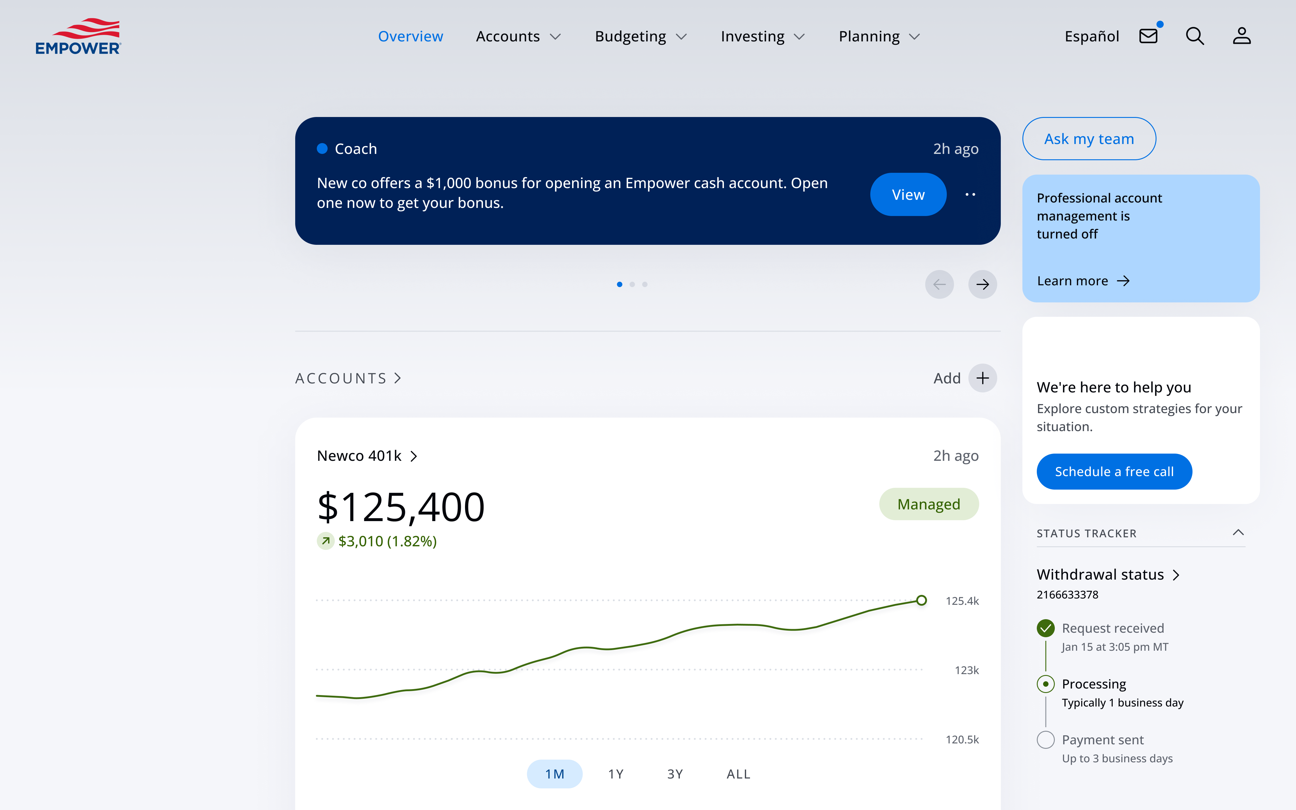
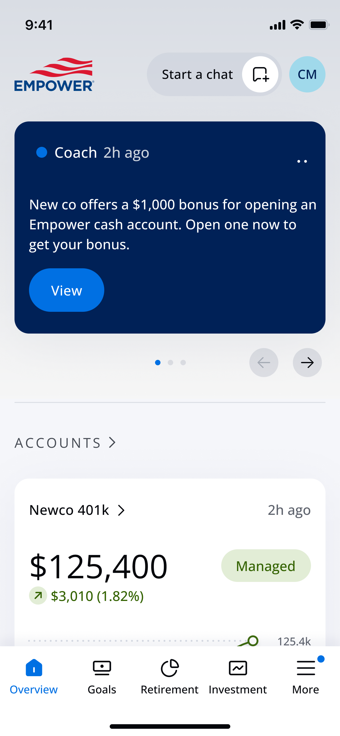
Rebuilt the IA around user-validated clusters and moved education to a primary-tier action, level with portfolio monitoring. Re-sequencing to lead with current financial status cut navigation dead-ends and reduced time-to-primary-action.
The dashboard listed every action at equal weight
90% of users wanted guidance that adapts to their circumstances. The dashboard gave them a flat feed.
Every next step competed for attention equally, so users with high intent could not identify a starting point.
Solution
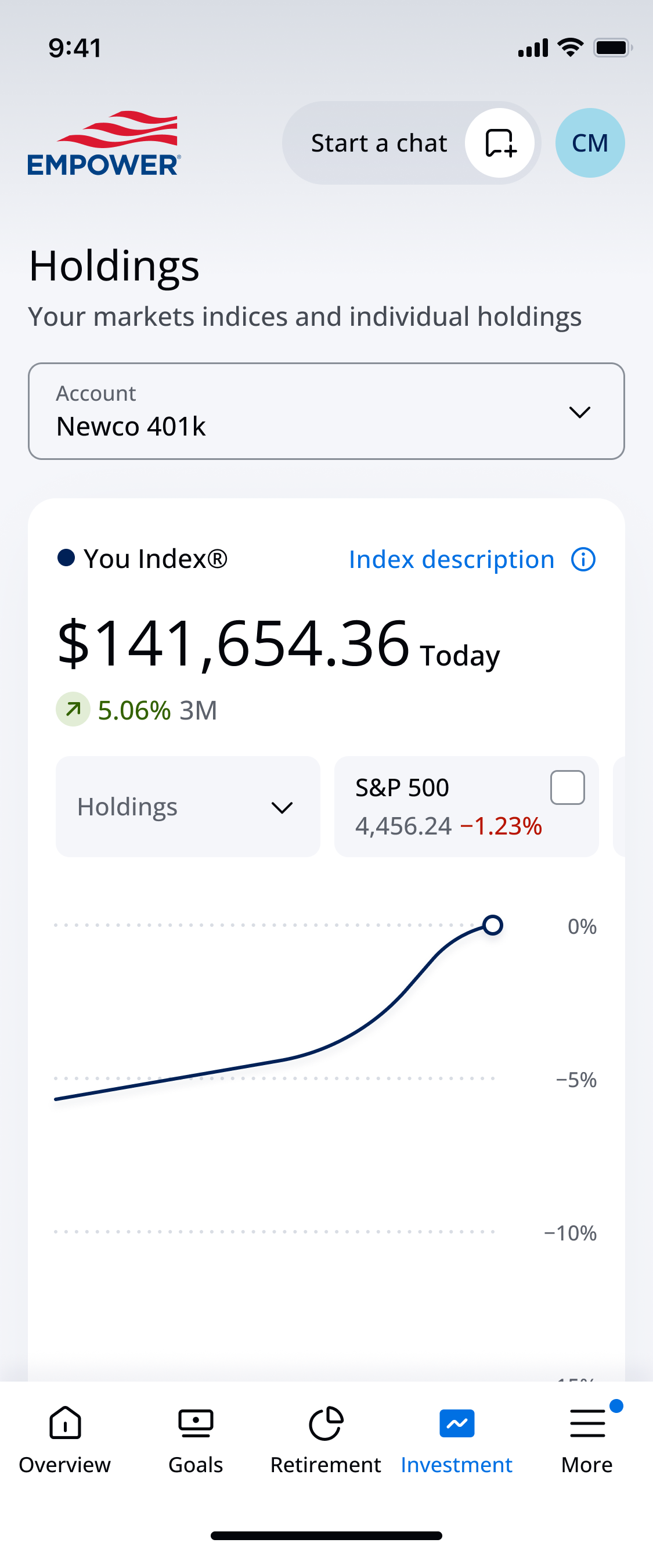
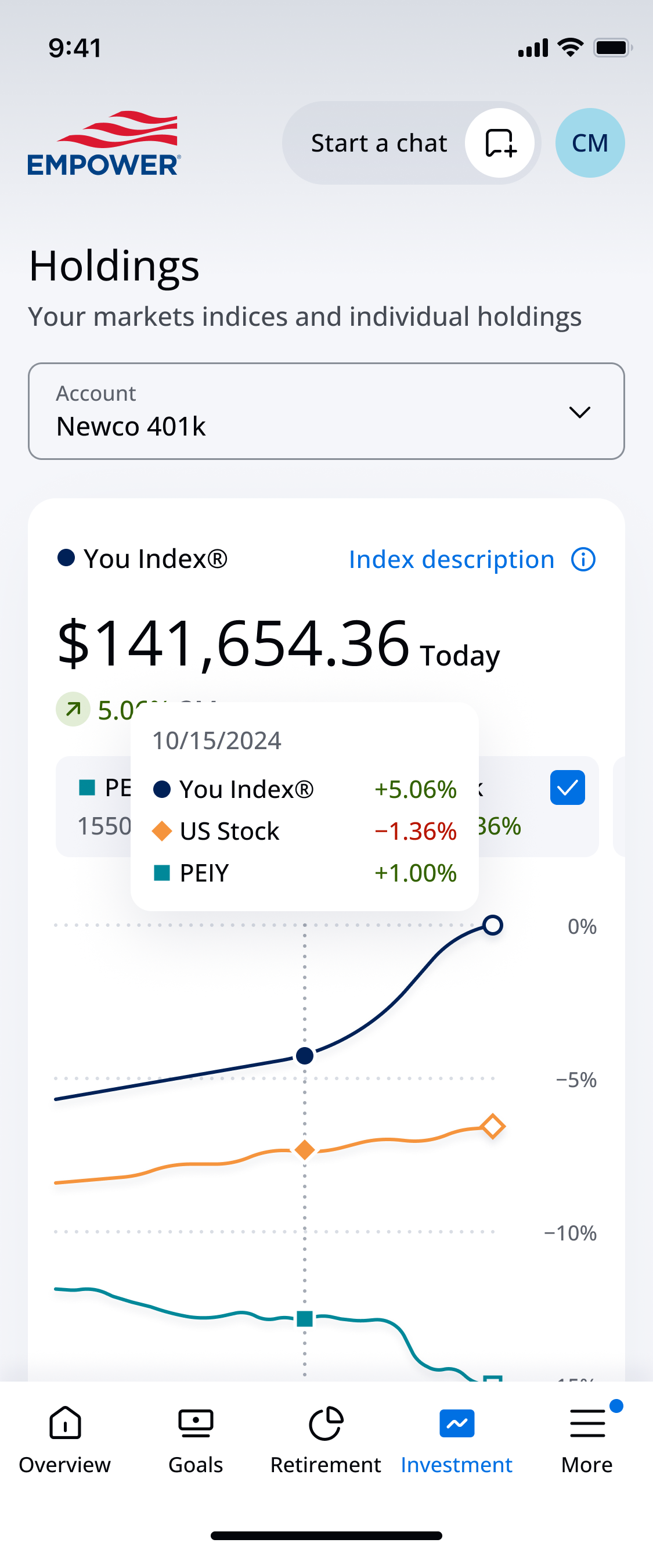
I defined four action tiers. Card weight and position carry priority.
Mandatory steps: required actions for account health.
Next best actions: personalized to individual goals and financial situation.
Education: financial-literacy content matched to the user's literacy level.
Upselling: features relevant to the user's current life stage.
Usability testing insight (March 2025)
Users praised the prototype as clean, modern, and uncluttered. Information was easy to scan and locate, thanks to large fonts, a clear widget layout, and deliberate content organization.
Complex questions routed users out of the app
Advisor access was a conversion exit: users with complex needs were handed to phone or email.
Solution
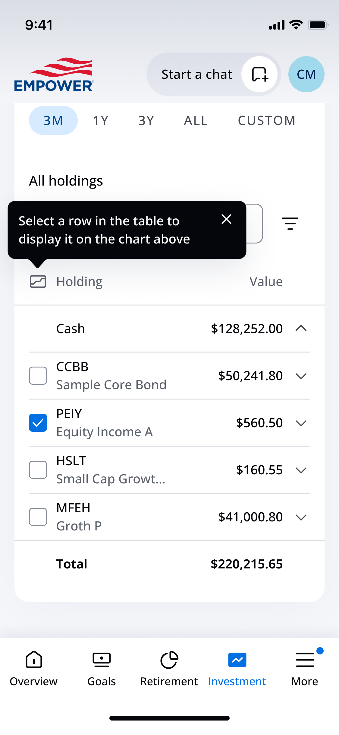
A dual-channel support layer lives in the dashboard. The Digital Coach answers pattern-based questions inline; human advisors are one tap away with full session context. The system, not the user, decides the channel.
Behavioral insight
Users trust AI for the google-able questions and a human for high-stakes decisions. Easy access to a human is what gives them confidence to try the Coach at all.
Usability testing insight
Users needed a clear line between product support and the Coach: “there has to be a clear distinction between the support chat and the AI coach chat.” The two channels are labeled and separated in the redesign.
Impact
69%
Doubt they will have enough to retire.
60%
Delay action, unsure where to begin.
90%
Want guidance that adapts to their circumstances.
4
Action tiers ranking the redesigned dashboard.
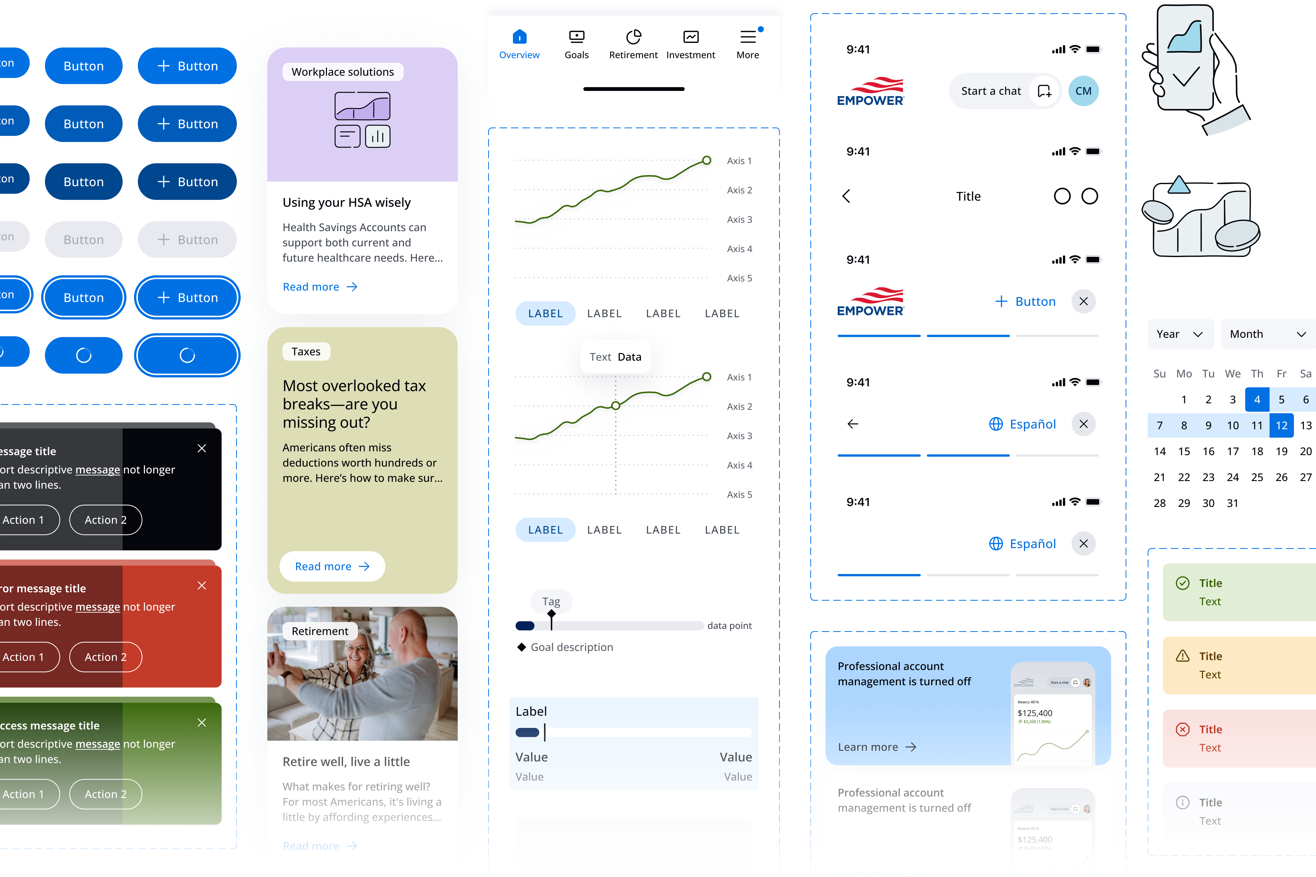
Design System
Atomic, reusable components, built for desktop, tablet, and mobile to WCAG 2.2 AA, and gives every future feature a single source.