Lucy in the Sky

Product
Lucy in the Sky is a direct-to-consumer fashion brand with a flagship store in Los Angeles. Core customer: Gen Z women in the US who shop by event, season, and social moment.
My Role
Owned UX/UI and an extended design system across the web store and the Flutter iOS and Android app. Worked alongside business owners, Product, Engineering, and Business analysts. Platforms: mobile web, desktop, tablet, iOS and Android.
The experience built a strong sense of brand but left buyers unsure how to act.
Bounce rate was extreme across all platforms.
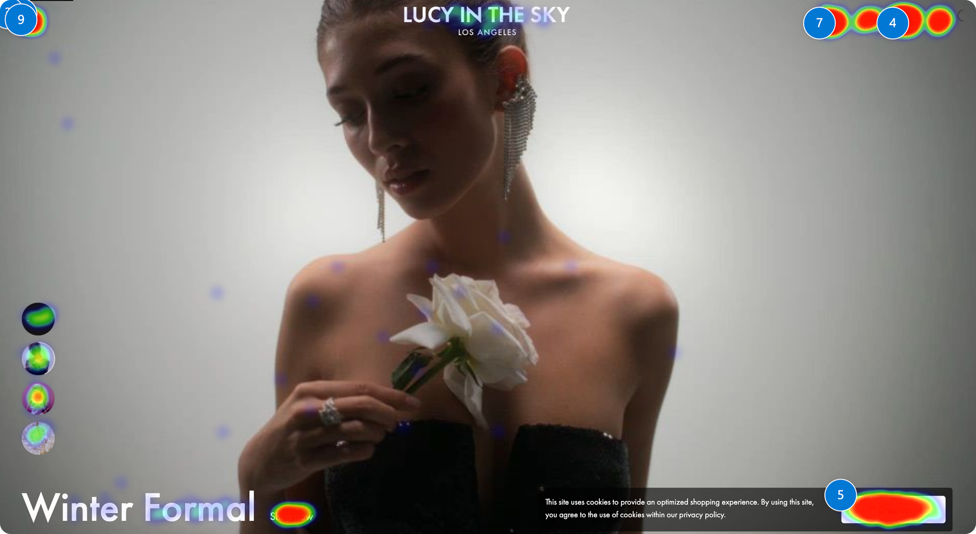
Web: the TikTok-style format held attention, and broke the funnel. Users were watching, not buying because of unclear purpose and invisible product range.
Behavioral insight
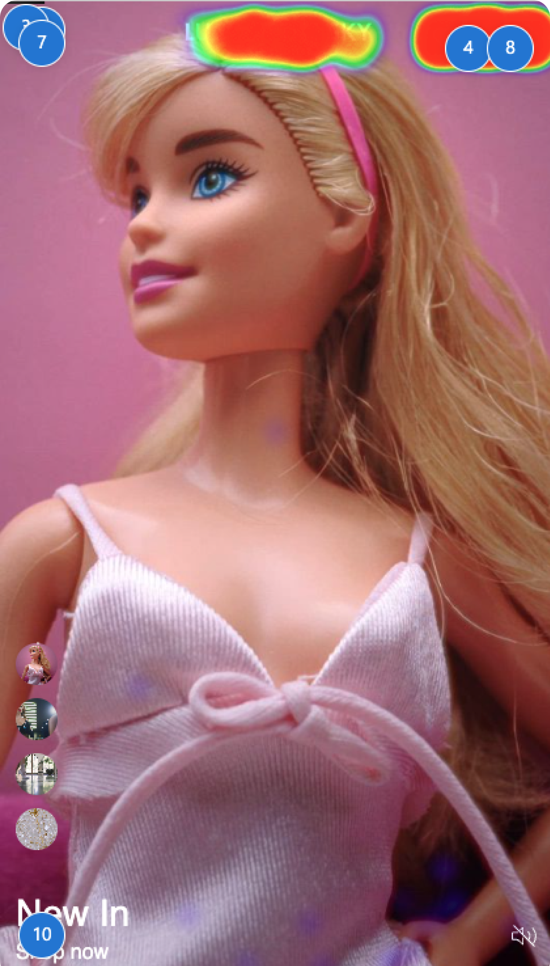
One video at a time hid the catalogue and removed user control. Auto-rotating content prevented evaluation. The screen communicated campaign, not product.
Solution
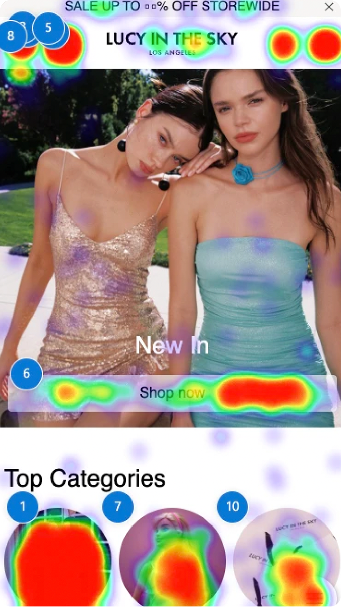
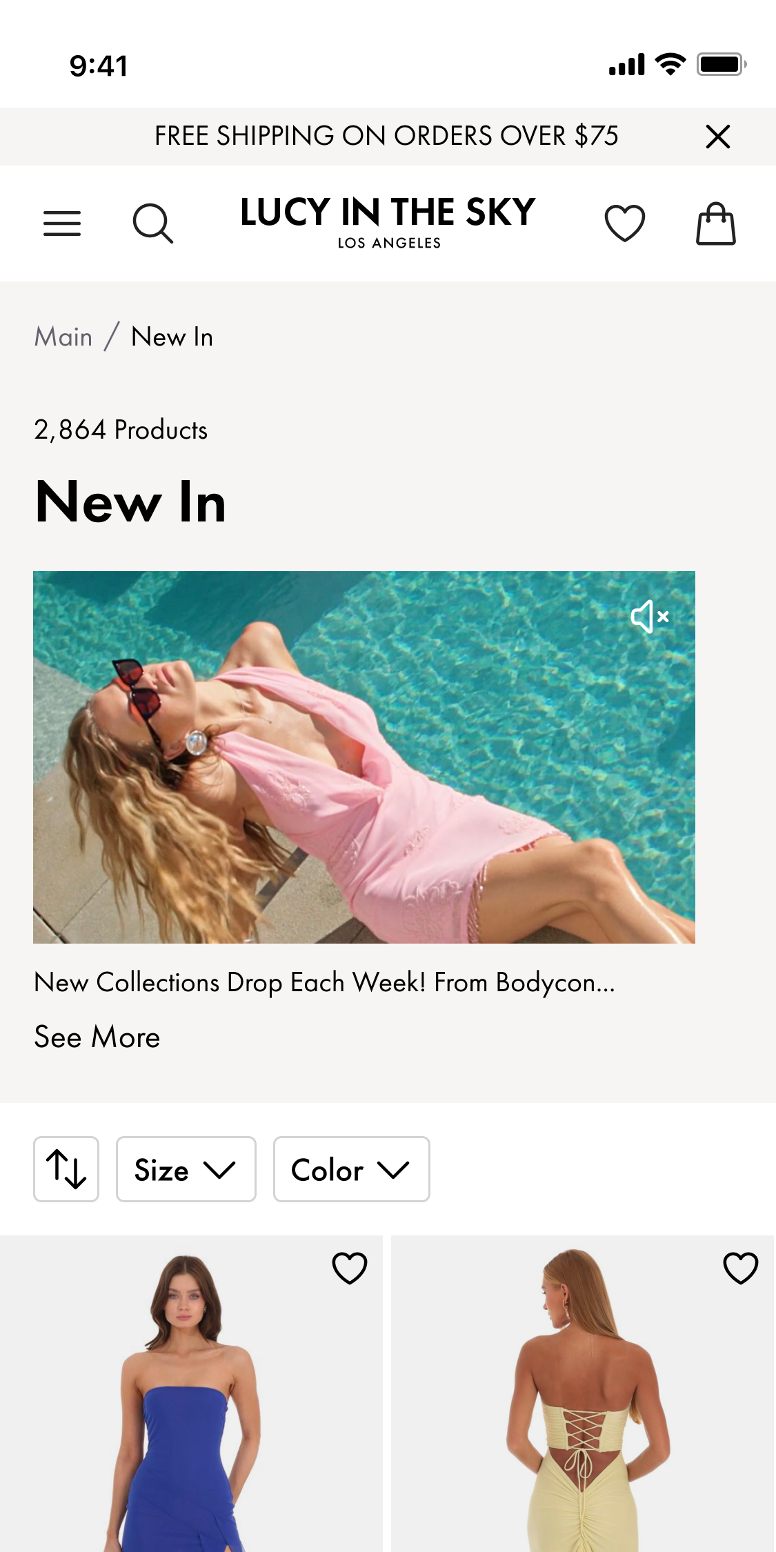
Hero area communicates intent and surfaces at least 40% of the catalogue. Accessible, predictable navigation builds direct paths to products.
Solution
The complete product discovery journey was rethought. Categories, filters, and recommendations now surface above the fold, so buyers reach product without scrolling for it.
In the app, navigation worked against the funnel.
Tabs appeared as category cards. The behaviour didn't match the signifier: every tap produced an unexpected result.
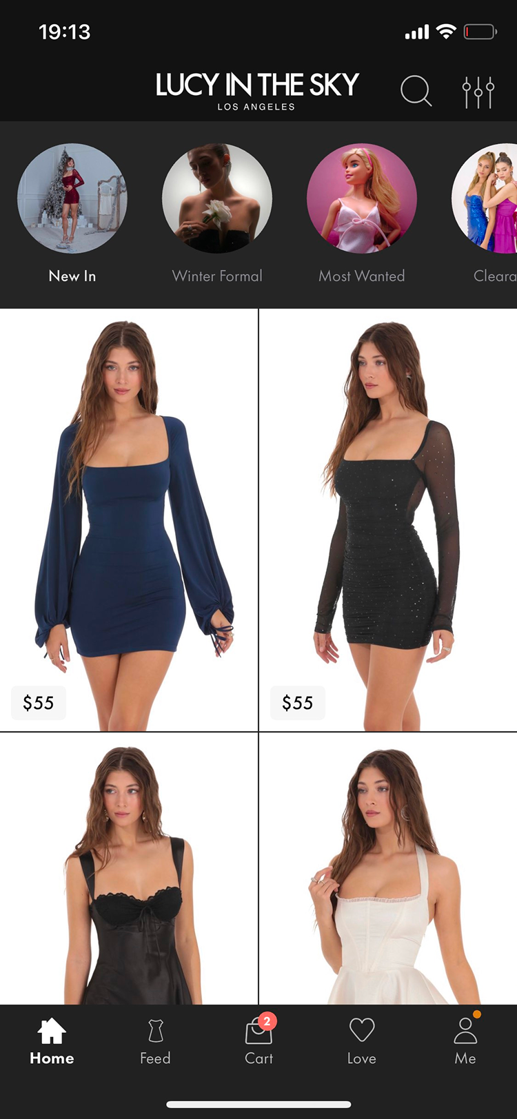

Behavioral insight
Search, a core discovery path, returned near-empty results: repetitive user-generated content with no quality control.
Solution
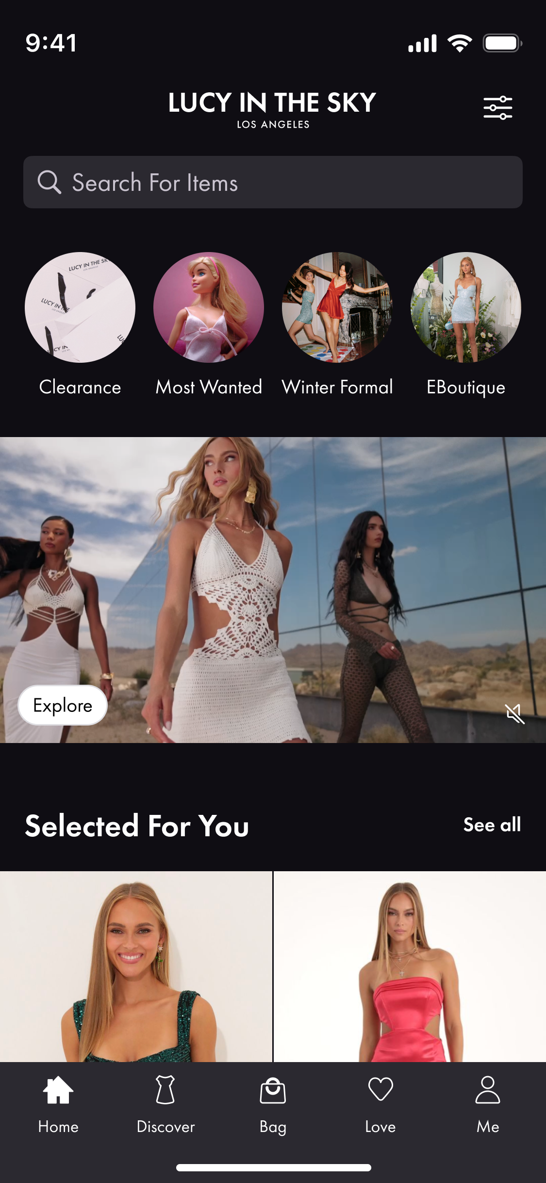
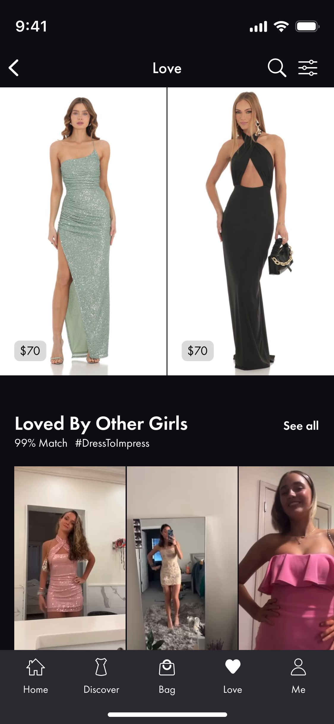
The home screen became the entry point. Category cards surface seasonal collections only, so buyers reach the collection they need in one tap. User-generated content is moderated and moved to a secondary path, the favorites section, keeping the primary shopping task free of distraction.
A/B test, mobile app
Across 75K users, classic navigation beat the TikTok format on every funnel metric: +9.35% sales, +9.68% add-to-cart, +44.38% PDP entries.
Buyers weren't approving push, and Lucy was losing a direct channel to its customers.
The app asked for push permission the moment users opened it, an interruption before they had any reason to say yes.
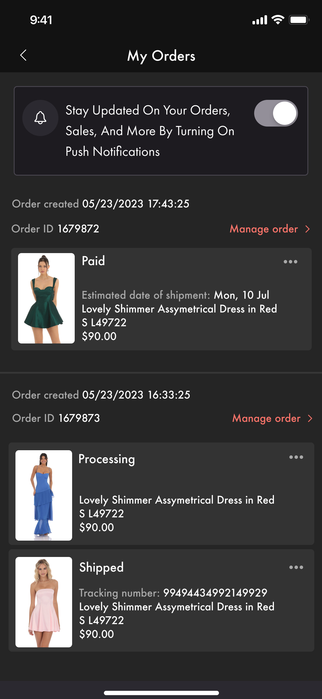
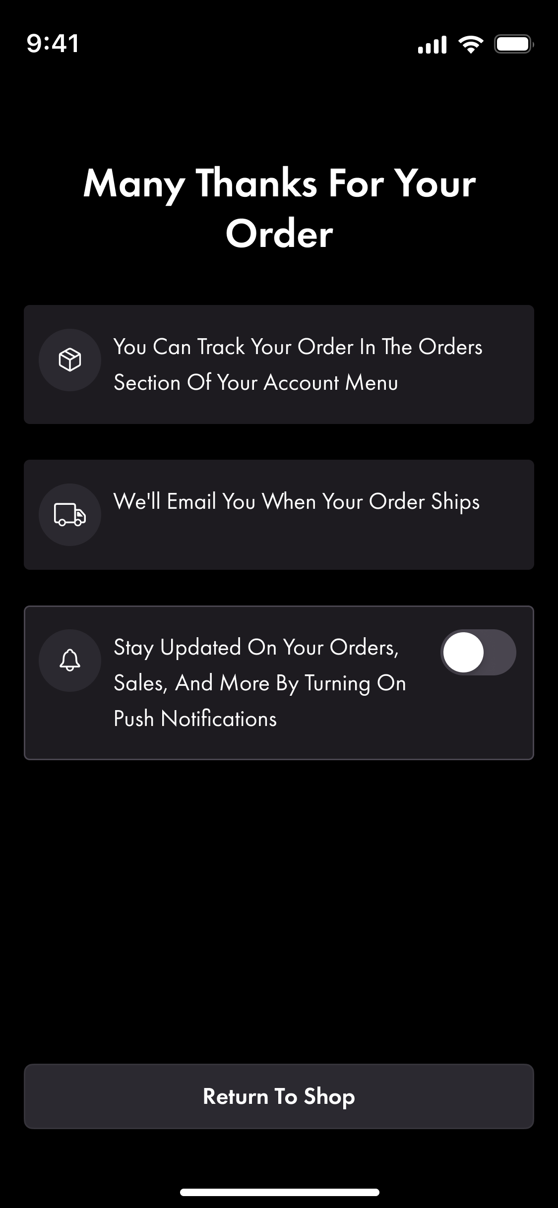
Solution
Push opt-in had plateaued at 40-42% for months. Permission banners moved to the moments users already care about the answer: after leaving a comment, on order success, on restock alerts, in My Orders.
Impact
+86%
Conversion to PDP.
1% to 80%
Occasion category discoverability.
+9%
Sales after switching to classic navigation.
+14%
Push opt-in from contextual permission banners.
Design System
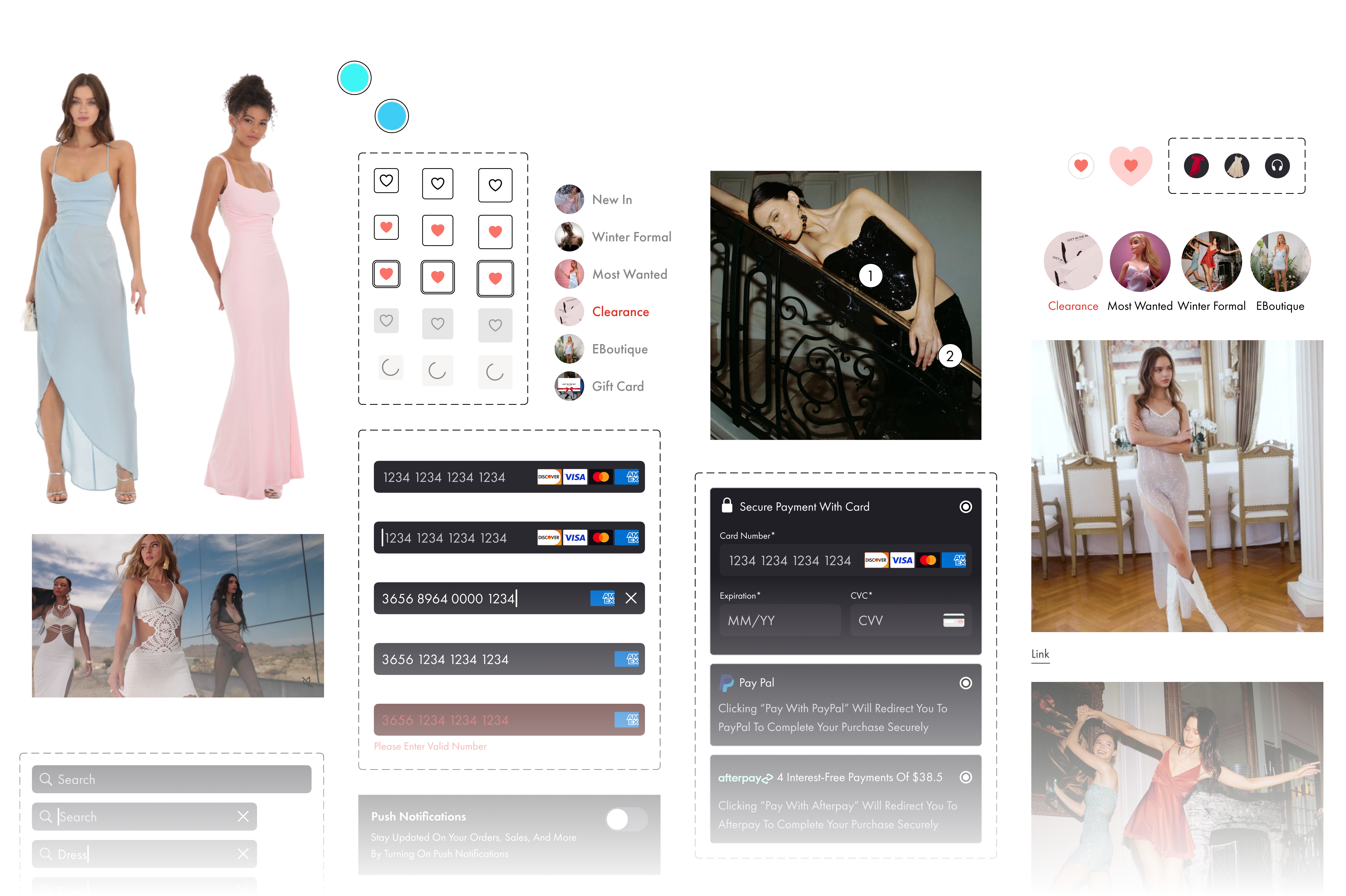
From audit to production — 2 Figma UI kits, one for mobile, one for desktop, with structured dev handoff and post-handoff collaboration, that helped build a scalable consistent design system.