The Empire State Building

Product
The Empire State Building is a 102-story skyscraper and New York's #1-voted tourist attraction, with 4 million annual offline visitors and 24K daily unique users on the ticketing website.
My Role
Product Designer responsible for UX, UI, branding, and design system across all experiences. I worked alongside a cross-functional team of design, product, and engineering, and owned research synthesis, interaction design, visual direction, and dev handoff.
The highest-traffic page buried its products
The Buy Tickets page carried 66.78% of all site traffic.
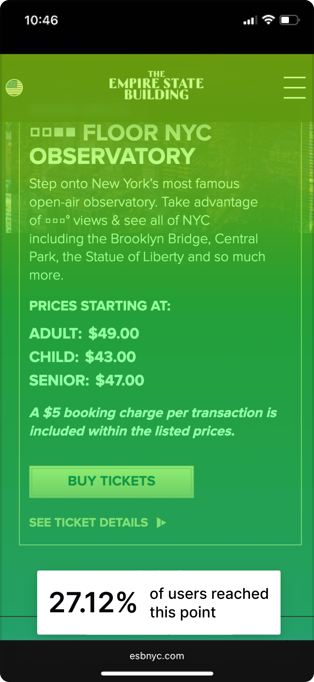
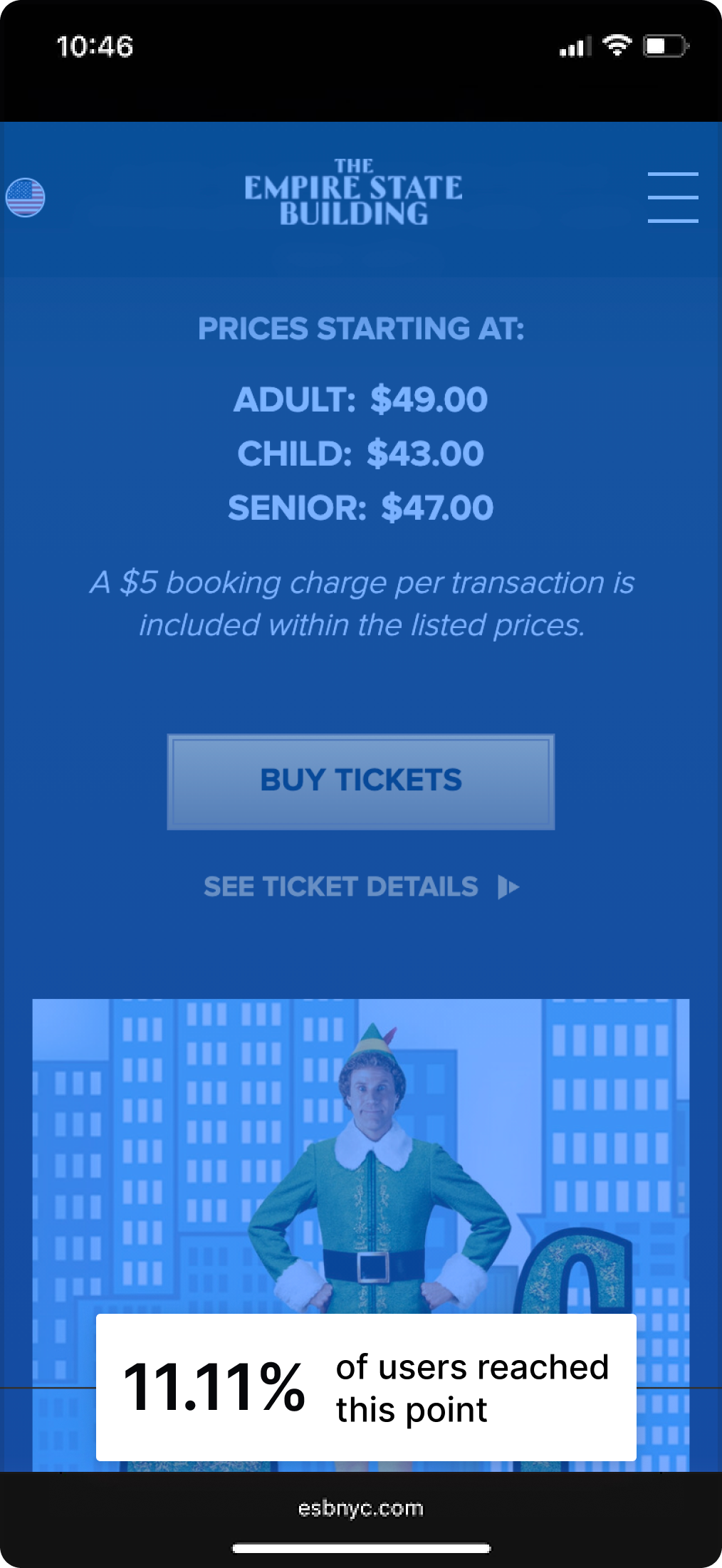
Only 27.1% of mobile visitors reached 5% of page depth. Express Pass, premium tier tickets, and promotional offers were effectively unseen: hidden from the 73% of visitors who left before reaching them.
Behavioral insight
Visitors arrived with high purchase intent but the page wasn't supporting the transactional behavior they came with.
Solution
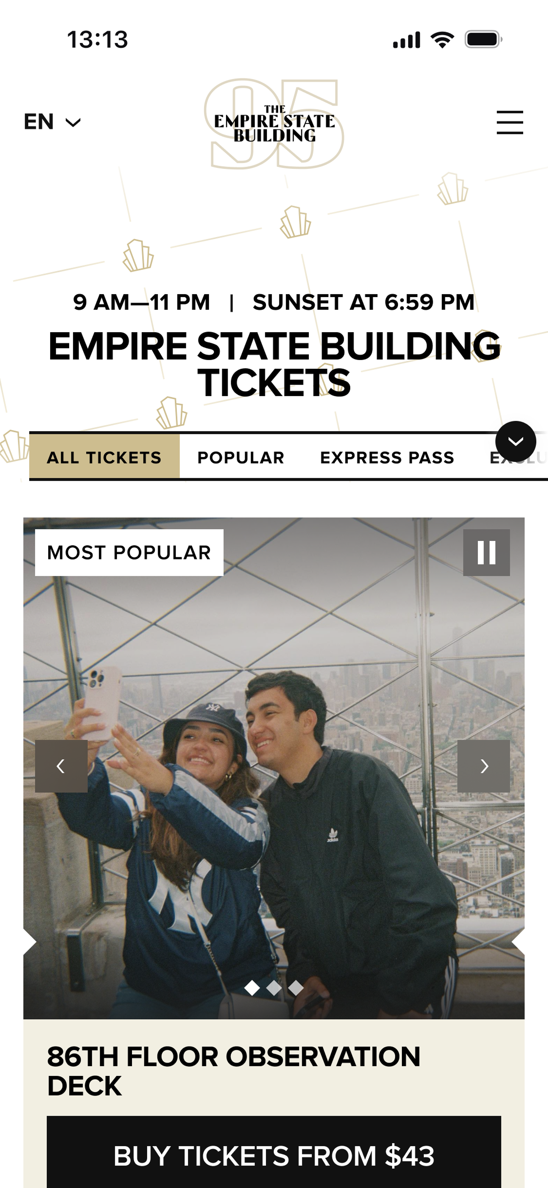
On the Buy Tickets page, the new hero shows ticket cards, categories, and pricing above the fold immediately. This way, users don't have to look for what they need.
Usability Testing Insight
“I would love to see an option for All, it's hard to compare if you don't see them all on the same page.” Added the All tab as a solution.
The homepage hero answered none of the questions buyers arrive with, and undermined the “Buy Tickets” CTA
The homepage hero was a full-screen video with no hours, no pricing, no tonight's lights.
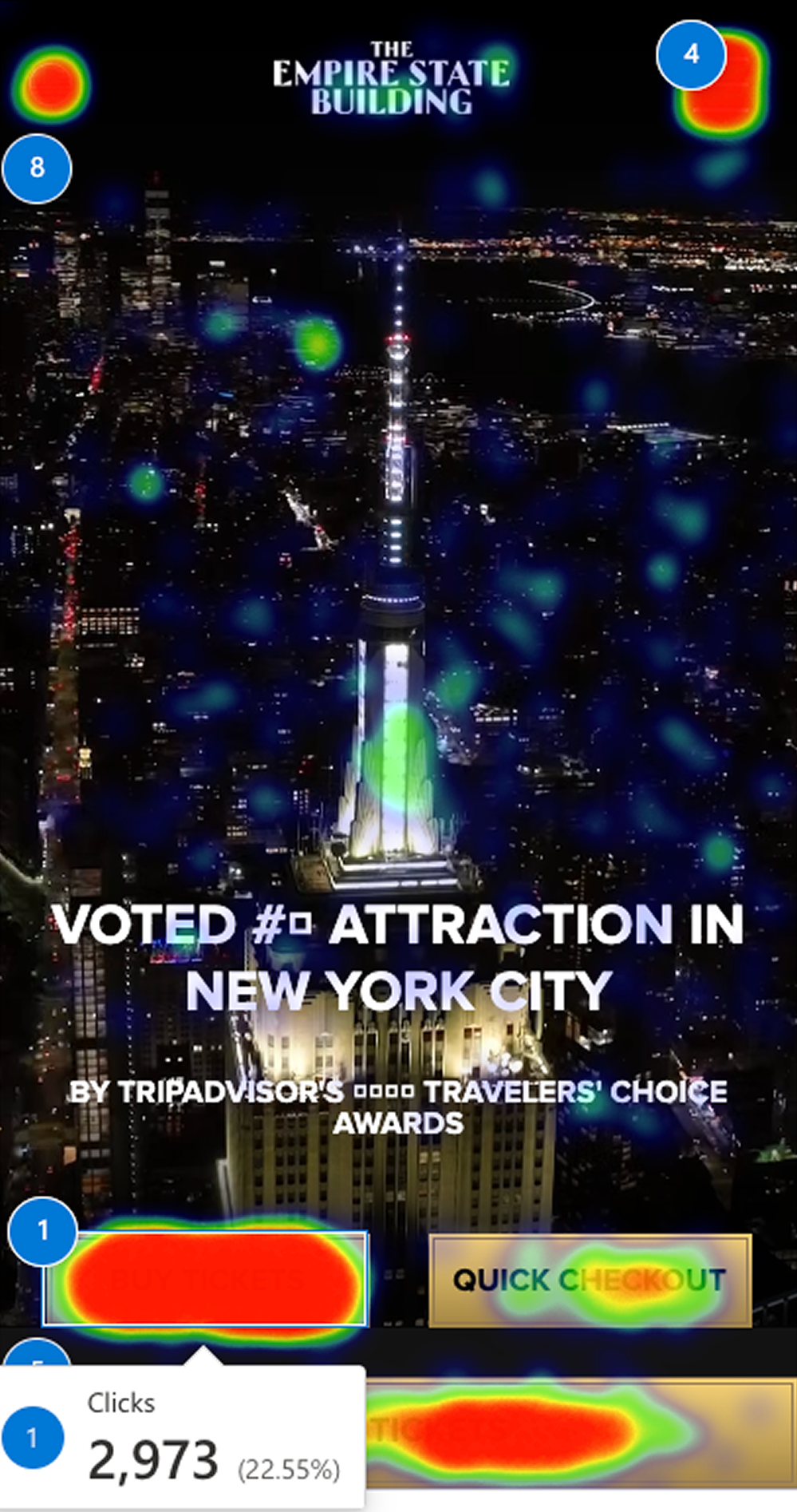
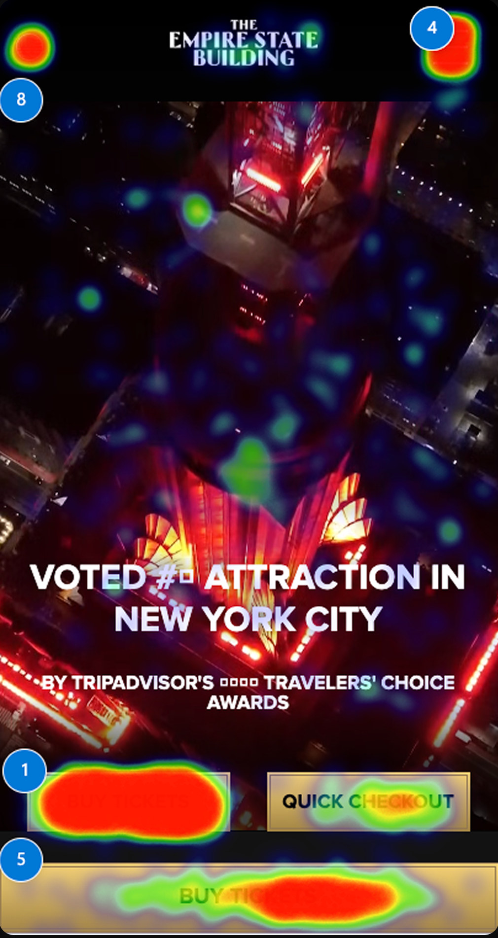
“Buy Tickets” sat embedded in the video background: the #1 clicked element across every device, yet visually competing with moving imagery.
Behavioral insight
The hero video and visuals receive clicks despite being non-interactive: users tap to pause, dismiss, or navigate content that offers none of those actions.
Solution
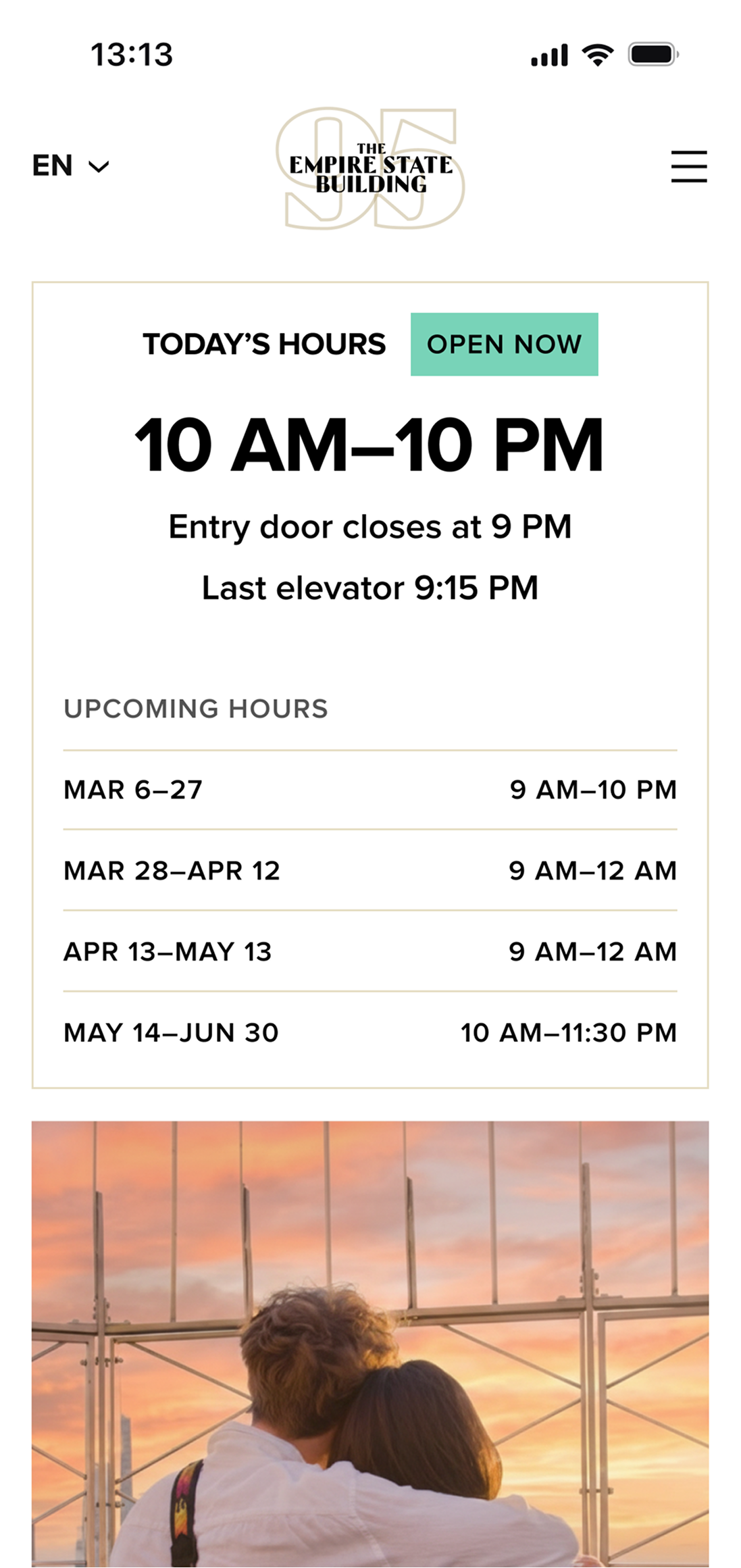
Optimized the above-the-fold area by tightening the hero, separating the CTA and headline from the video, and surfacing key info early: hours, today's lights.
Core Experience
Product Designer responsible for research synthesis, information architecture, dashboard design, visual design system and accessibility framework.
The new visual direction reconsidered ESB's original color palette and introduced a media-forward, clean take on Art Deco heritage.
It uses lighter, more delightful elements to shift the tone from “historic attraction” toward “top contemporary attraction.”
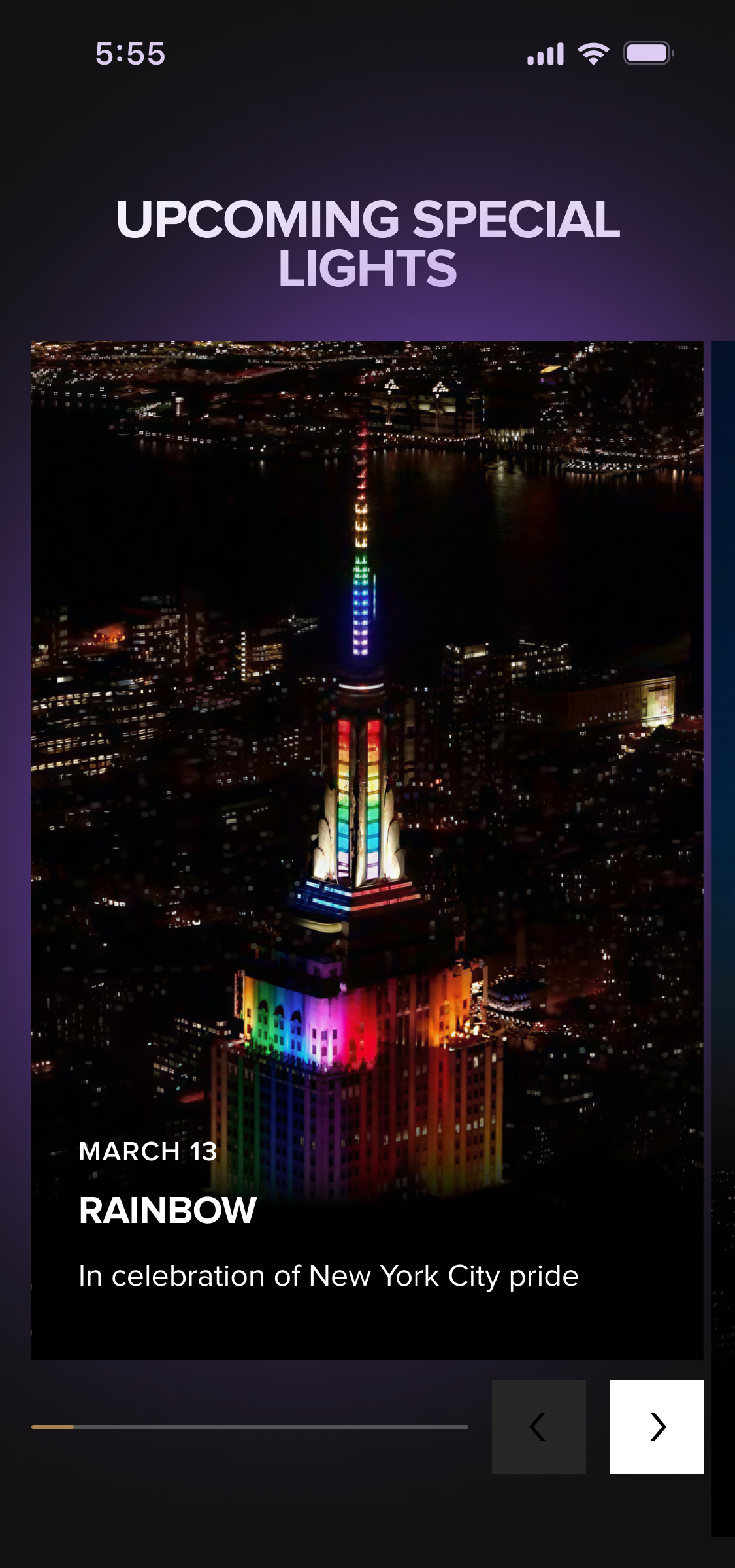
The new website shifted the visual direction toward authentic ESB views: the architecture, the observation decks, the skyline from 86 floors up. Lifestyle imagery supports. The building leads.
Tower Lights
Built for the people who follow the building's iconic lights. As in the ticketing flow, the core task needs no scroll: the hero leads with the calendar and tonight's light.
The celebrity-visit indicator became an icon, keeping lighting color the primary focus and celebrity visits secondary. The subscription control now separates SMS and email into distinct actions.
Tower Lights and the Calendar are a high-AEO asset
AI answers “what color is the ESB tonight?” straight from this page.
Scroll depth drops after Today’s Light and the Calendar, as expected for a utility page, and AI crawls the deeper content regardless. Consolidating Lights and Calendar under a structured top section makes ESB the authoritative source across AI search, and lets history, partnerships, and symbolism carry brand and B2B value.
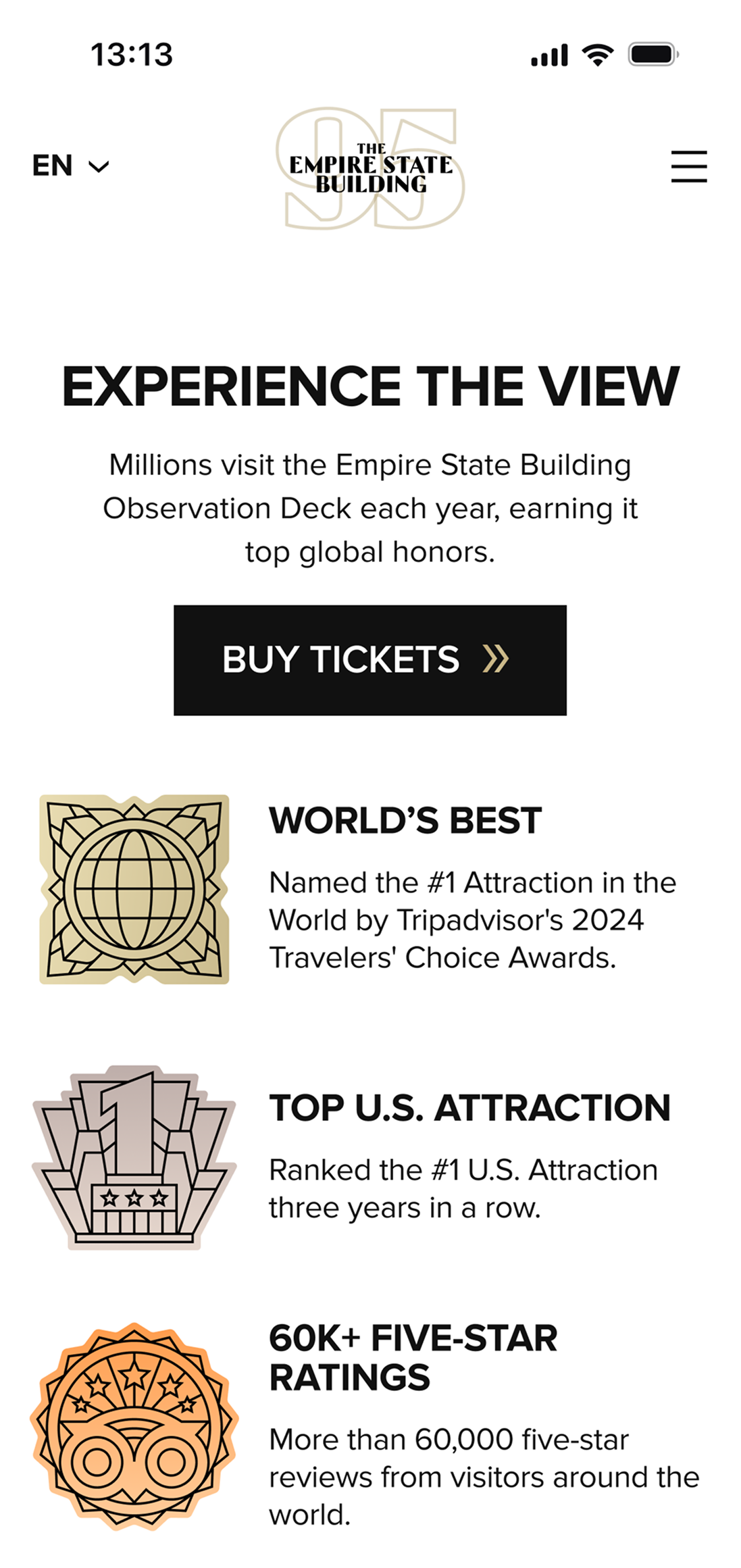
Behavioral insight
Deeper sections see lower human engagement. AI extracts them anyway.
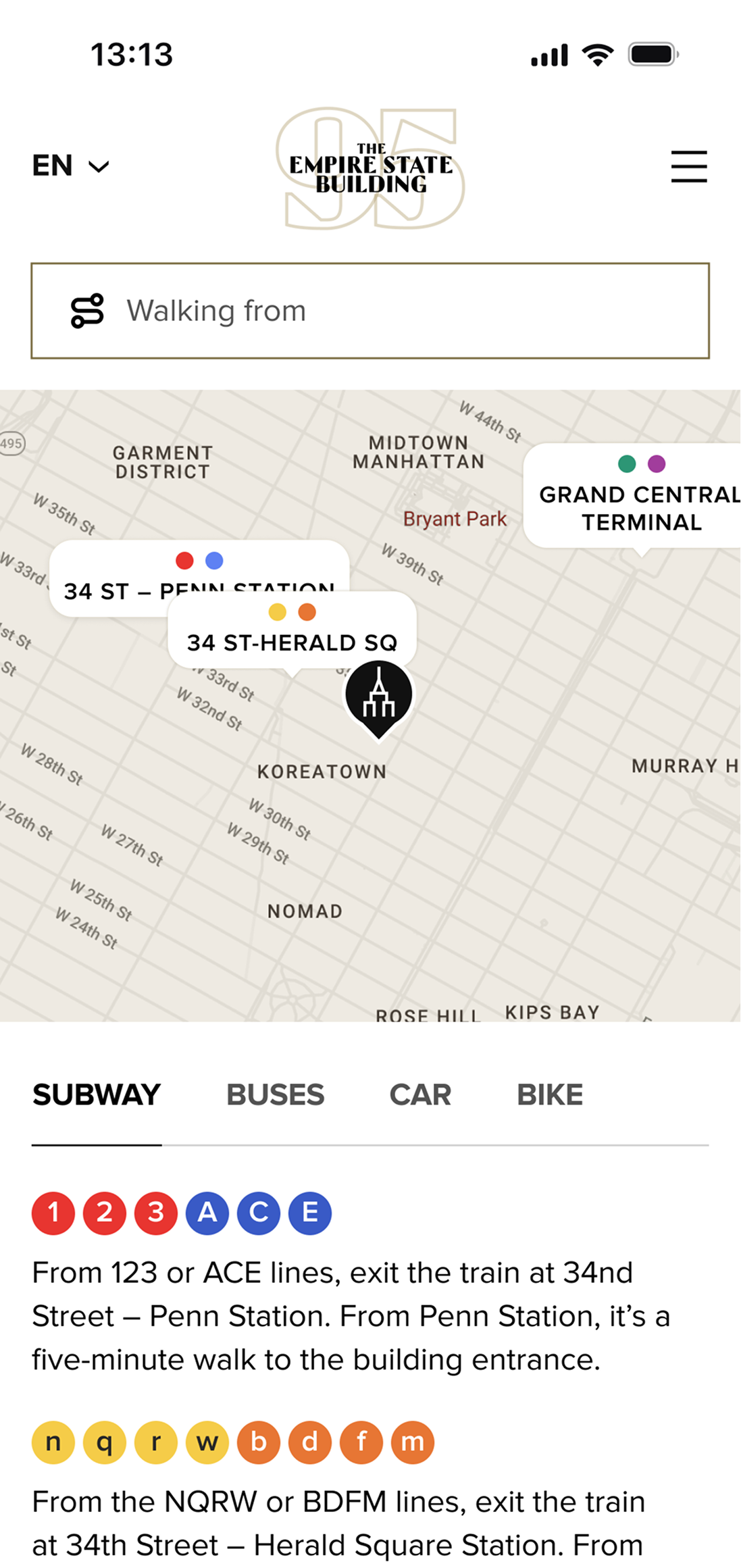
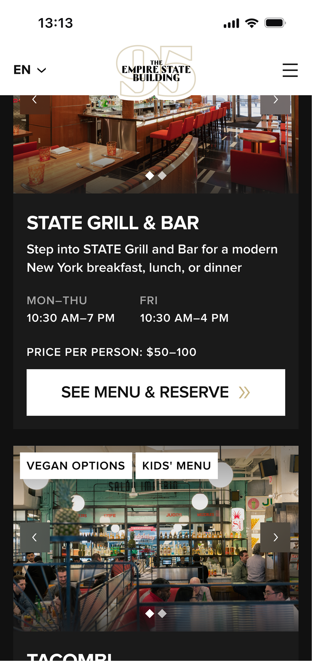
Visit planning
Satisfaction starts before arrival. How to get there, when it opens, and where to eat decide whether a visit runs smoothly. Surfacing this information in the same flow removes friction before the trip begins and lifts on-site satisfaction.
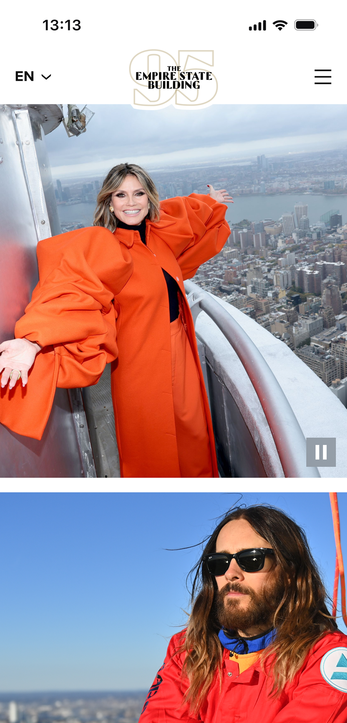
Social proof
Celebrity images run subtly across the site, alongside real visitor photos and shots of ESB staff. The mix reads as social proof, not advertising: it builds trust and drives ticket sales.
Impact
+25%
1 in 4 visitors actively view & interact with non-default tickets.
+5%
Premium ticket conversion.
Design System
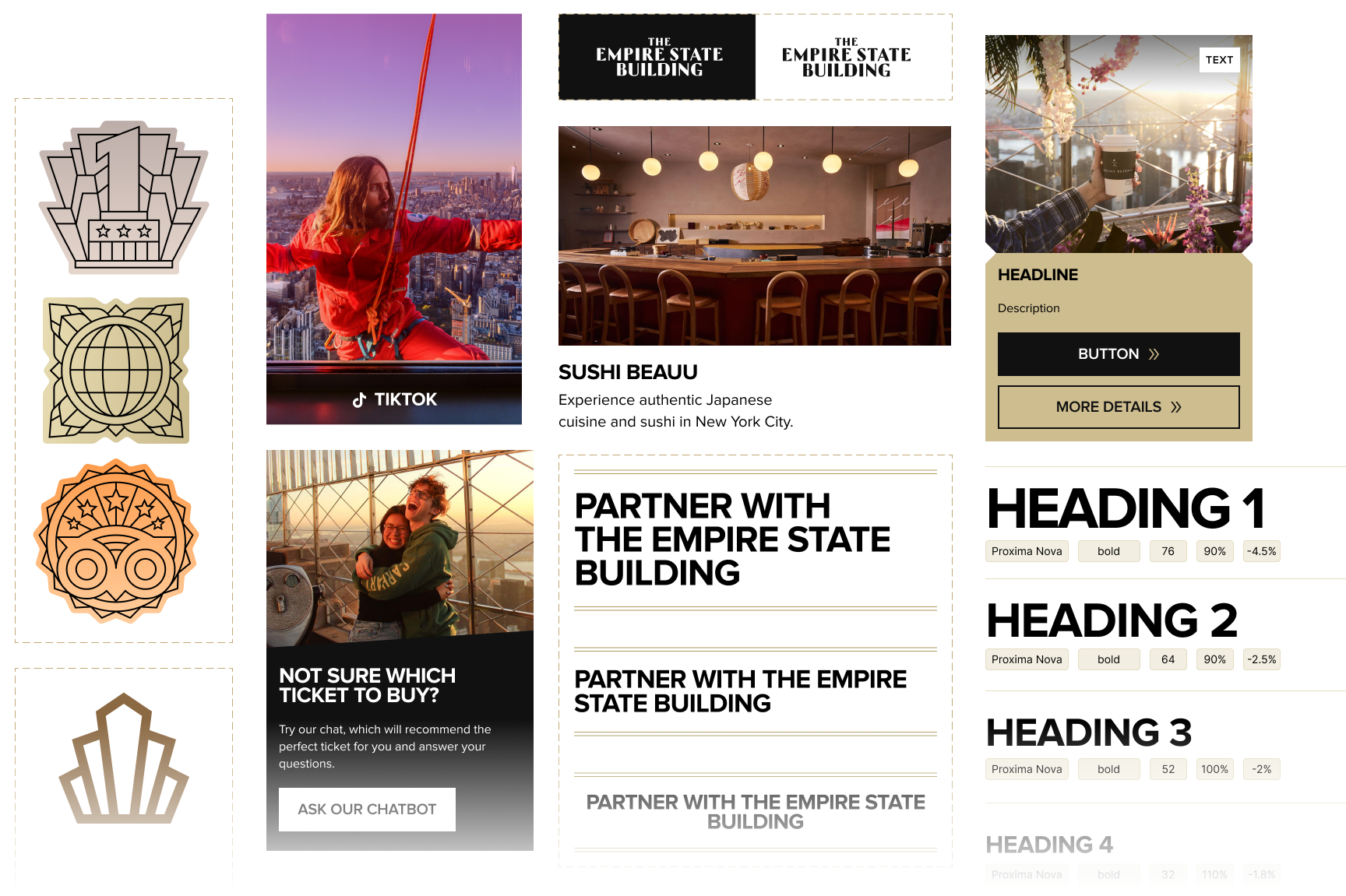
From tokens to production — a Figma UI kit with structured dev handoff and Claude-powered audit.