
Gold.com
2024-2025
Beyond Investment: Marketplace Design
The world of precious metals has long lagged behind in digital innovation. Websites across the category — including Gold.com’s predecessor — struggled to deliver a seamless user experience that aligned with evolving customer expectations.
With a clear vision for innovation, Gold.com set out to create a platform that merges trust and usability, combines commerce with education, and redefines what a premium investment experience should feel like.
Results
Transformed a legacy precious metals retailer into a high-trust digital
marketplace. Optimized the discovery and purchase flow (↓68%
navigation time). Built the information architecture and created a design
system that reduced delivery time by 35%.
Project Milestones
3.
4.
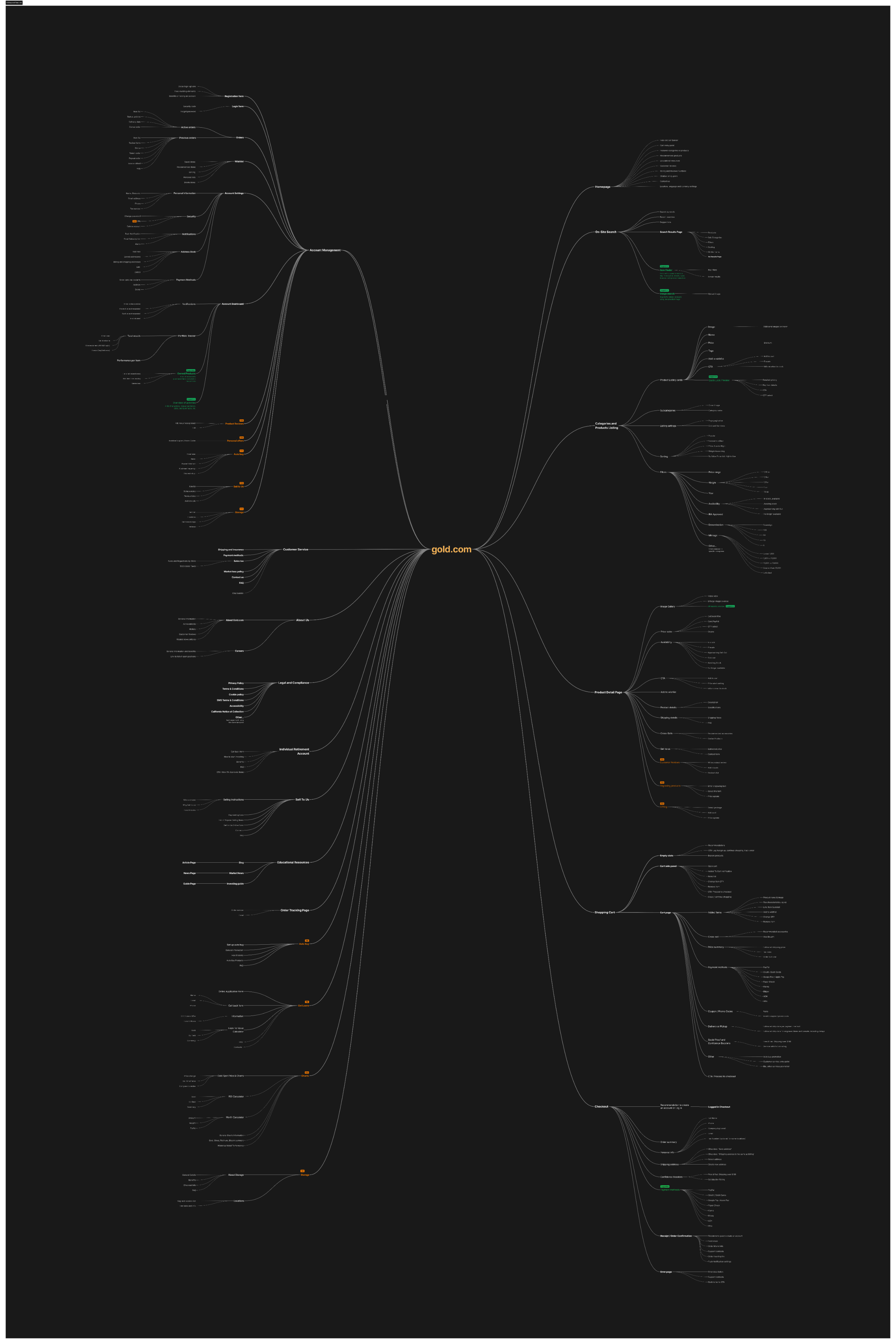
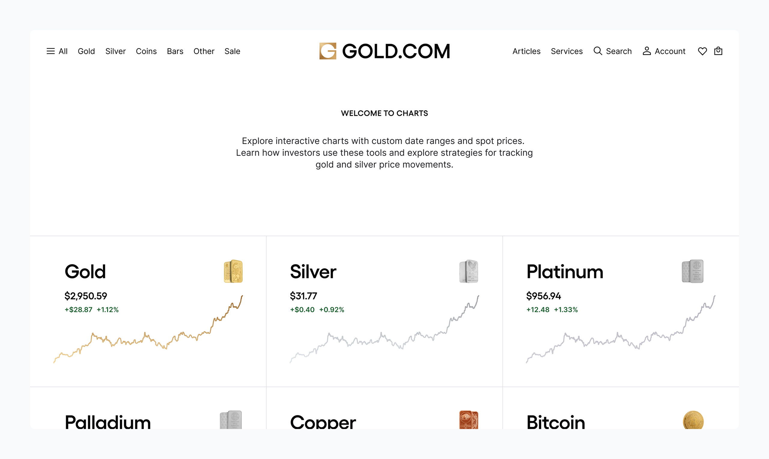
Information Architecture: A Smarter Structure for A Modern Marketplace
The restructured information architecture of Gold.com delivers a more intuitive, scalable, and conversion-oriented experience — built to meet the demands of a modern precious metals marketplace.
Foundations

- Stakeholder Interviews
- User Interviews
- Marketplace Audit
- Competitive Analysis
- UX & Accessibility Standards
Translating Strategy into Function: From Wireframes to High-Fidelity Design
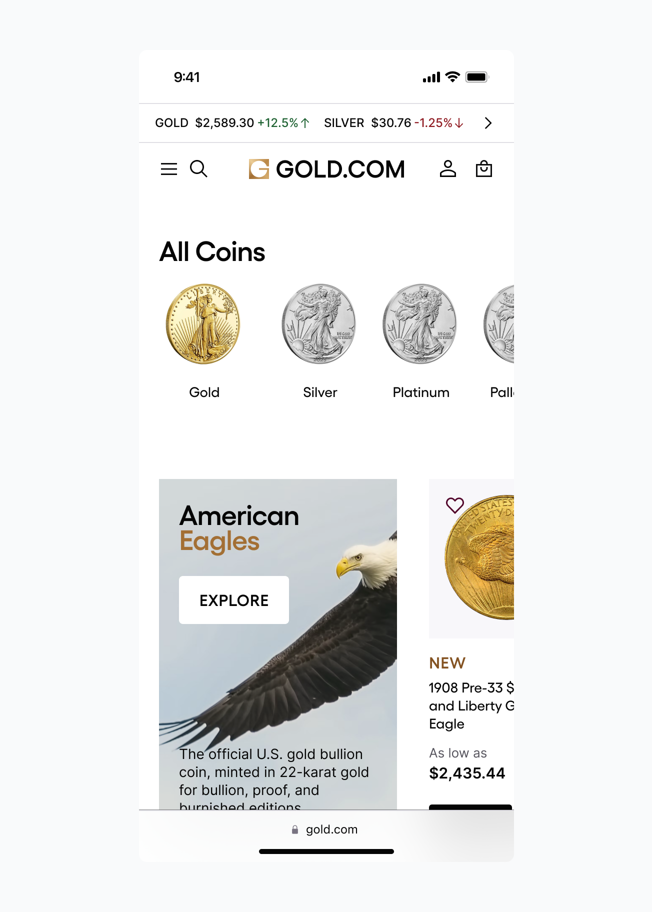
A rigorous wireframing and prototyping phase ensured that the Gold.com marketplace structure translated into a seamless user experience — well before visual design began. This strategy reduced iteration friction, aligned stakeholders early, and enabled on-time delivery without compromising quality.
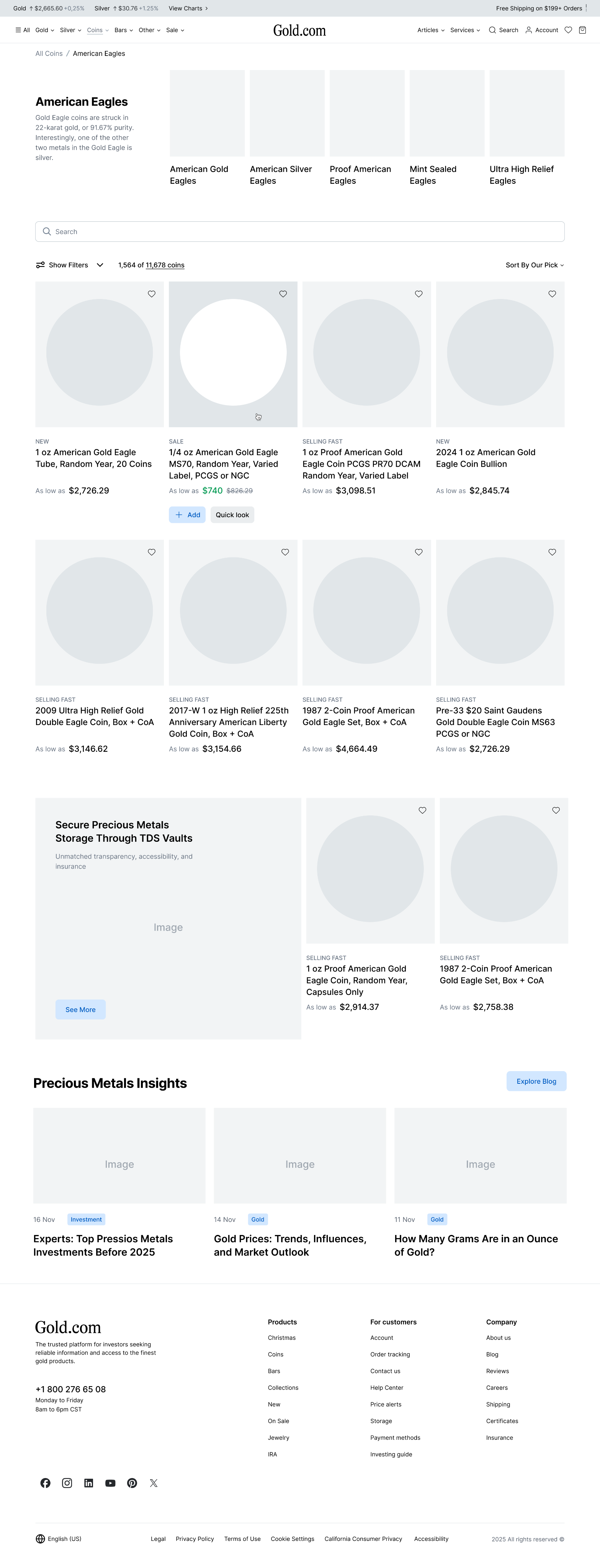
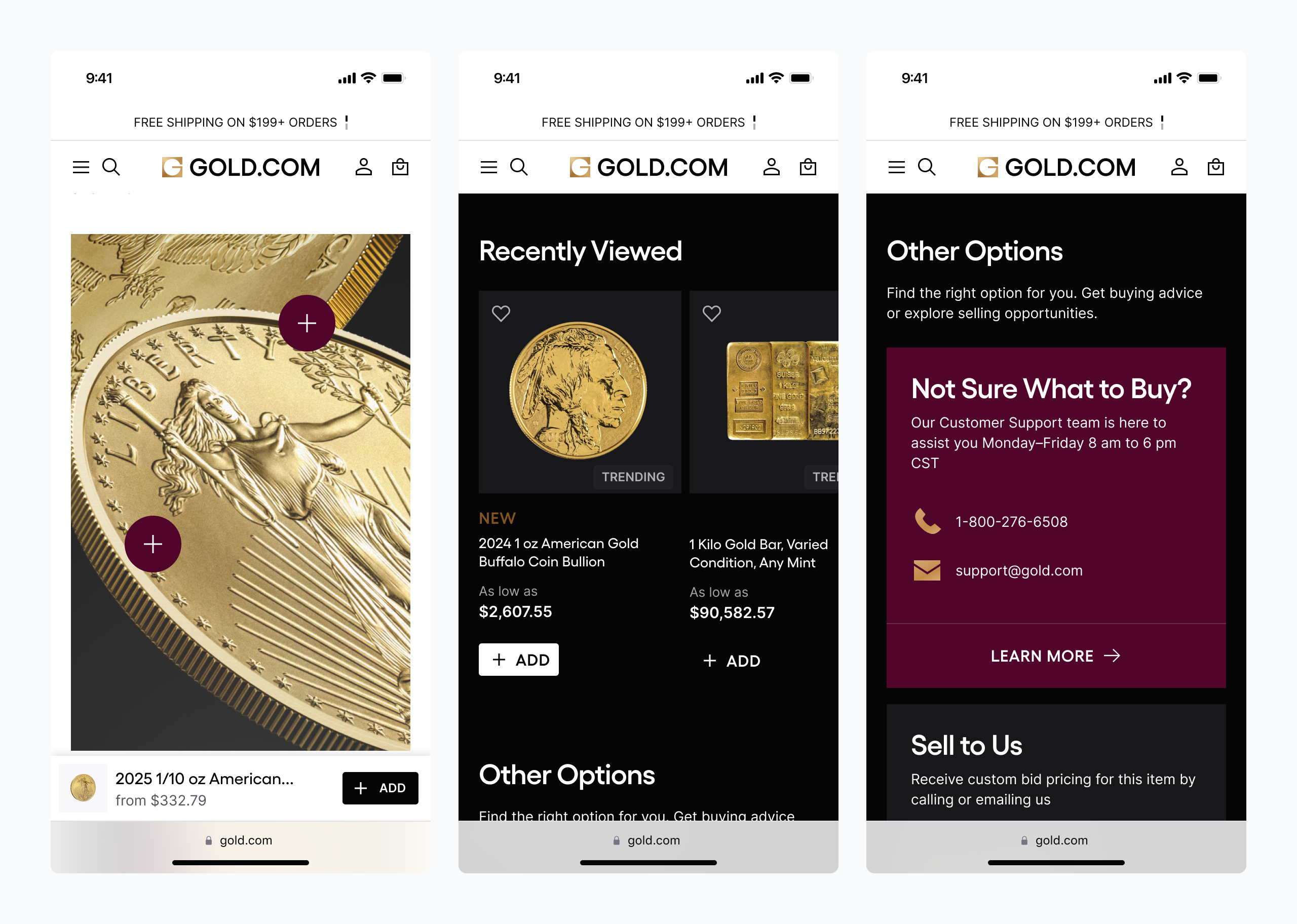
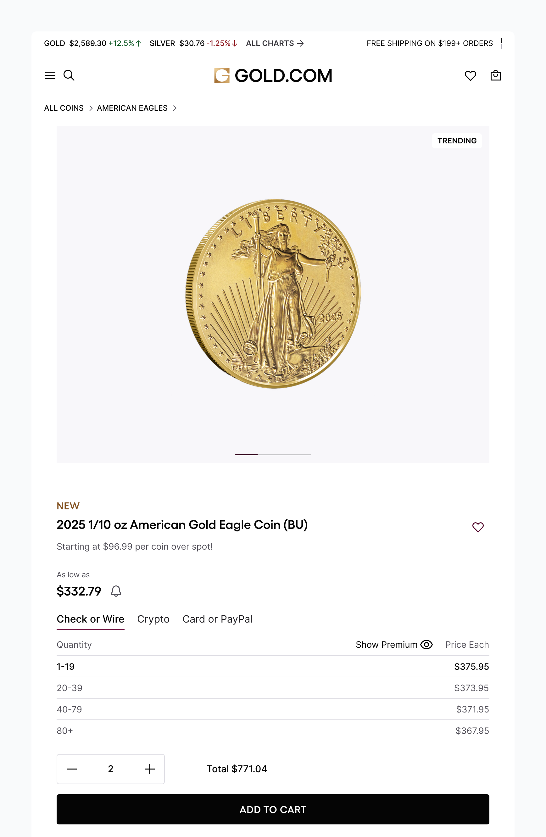
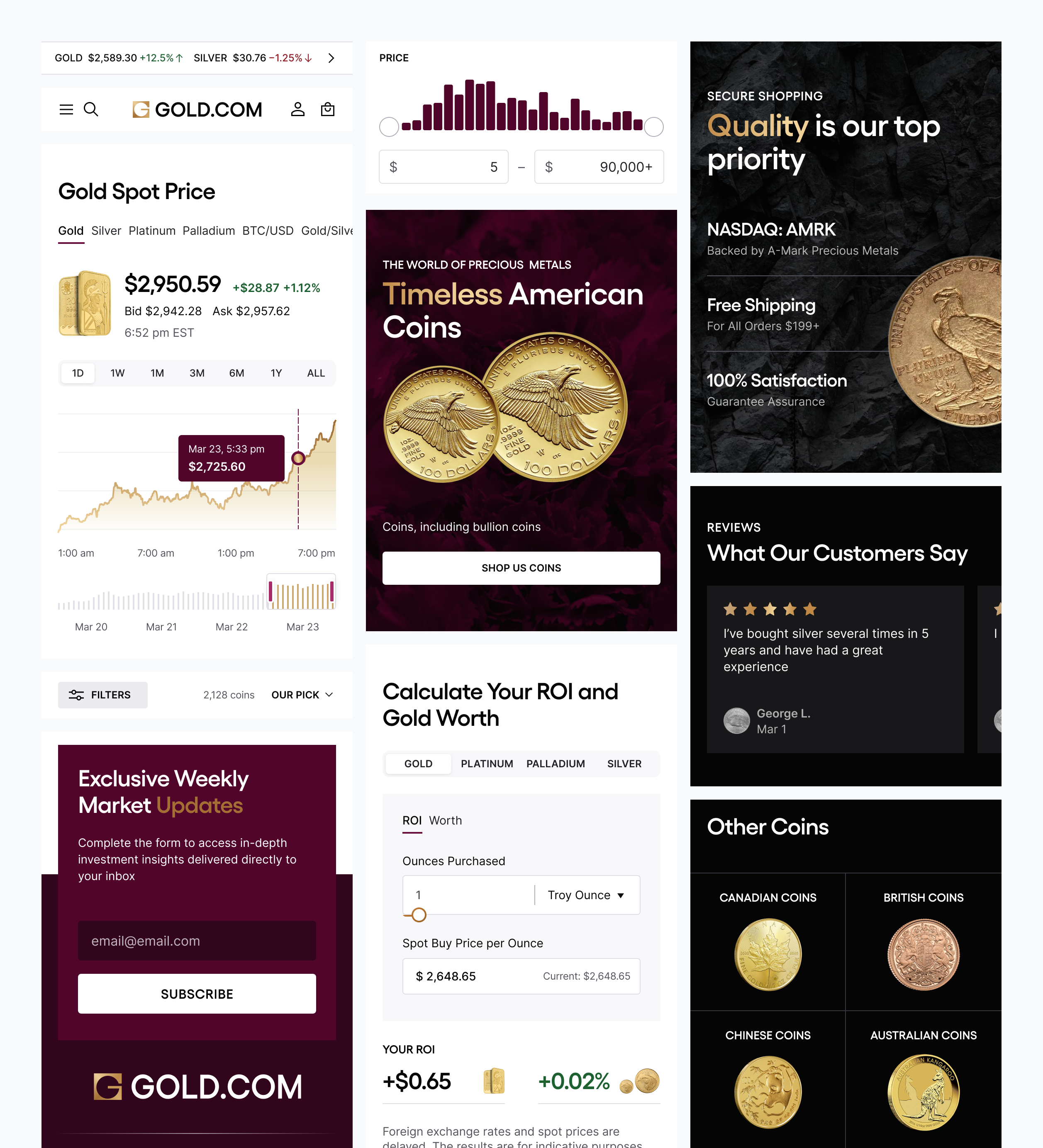
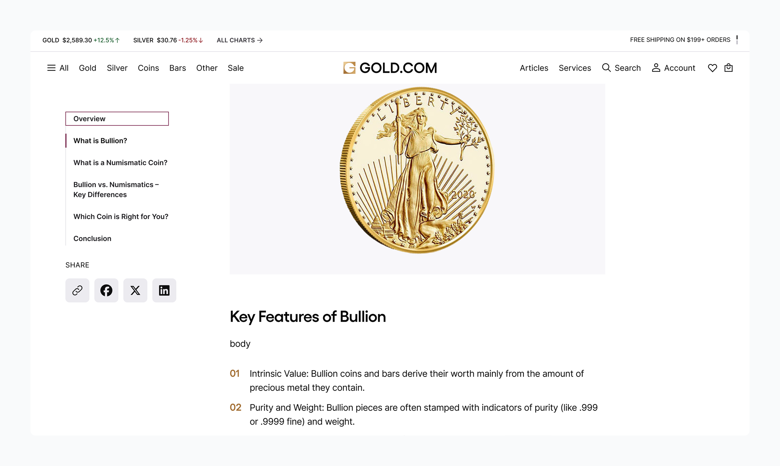
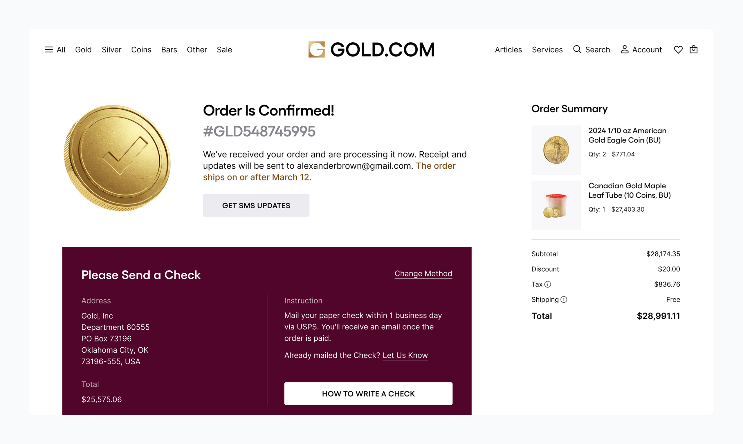
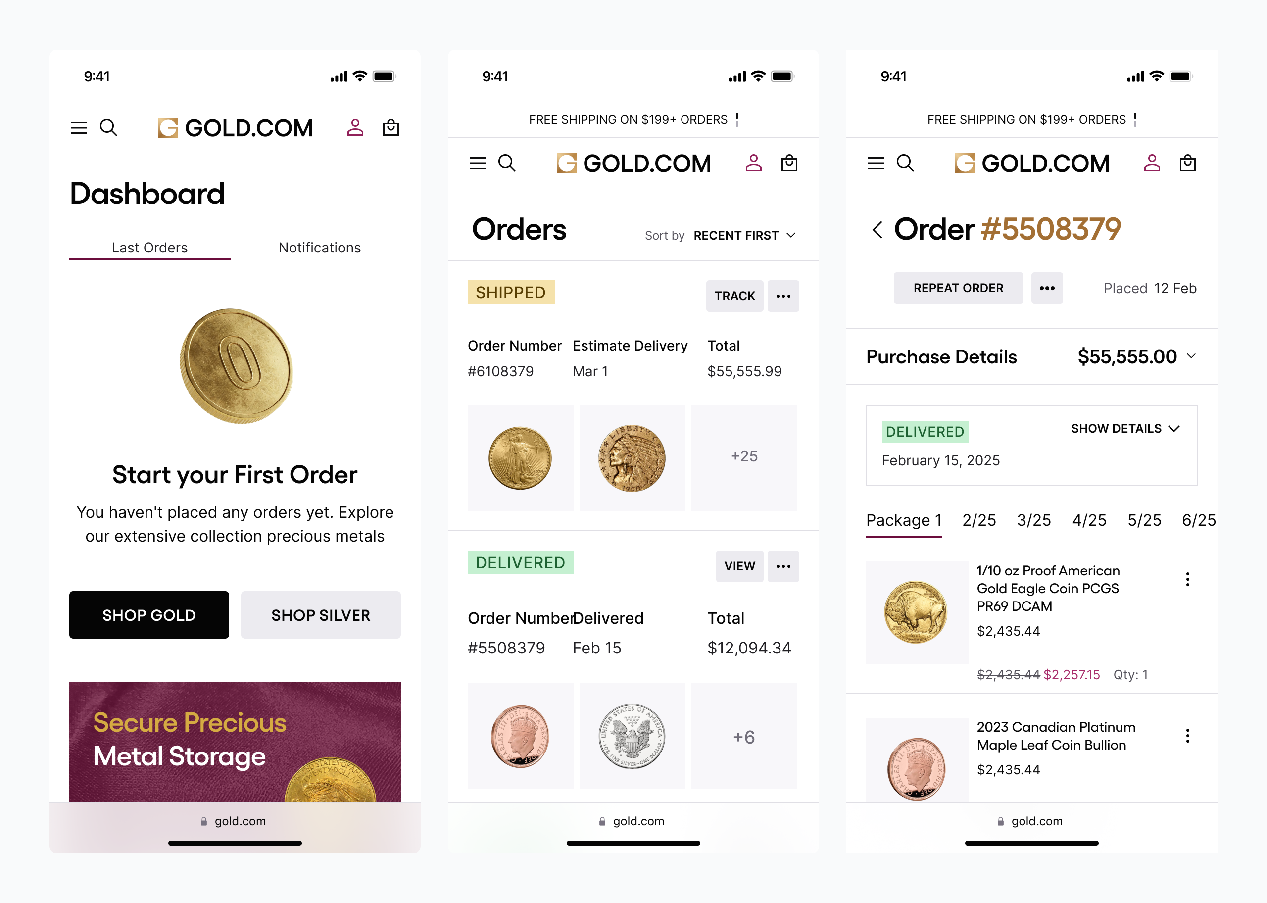
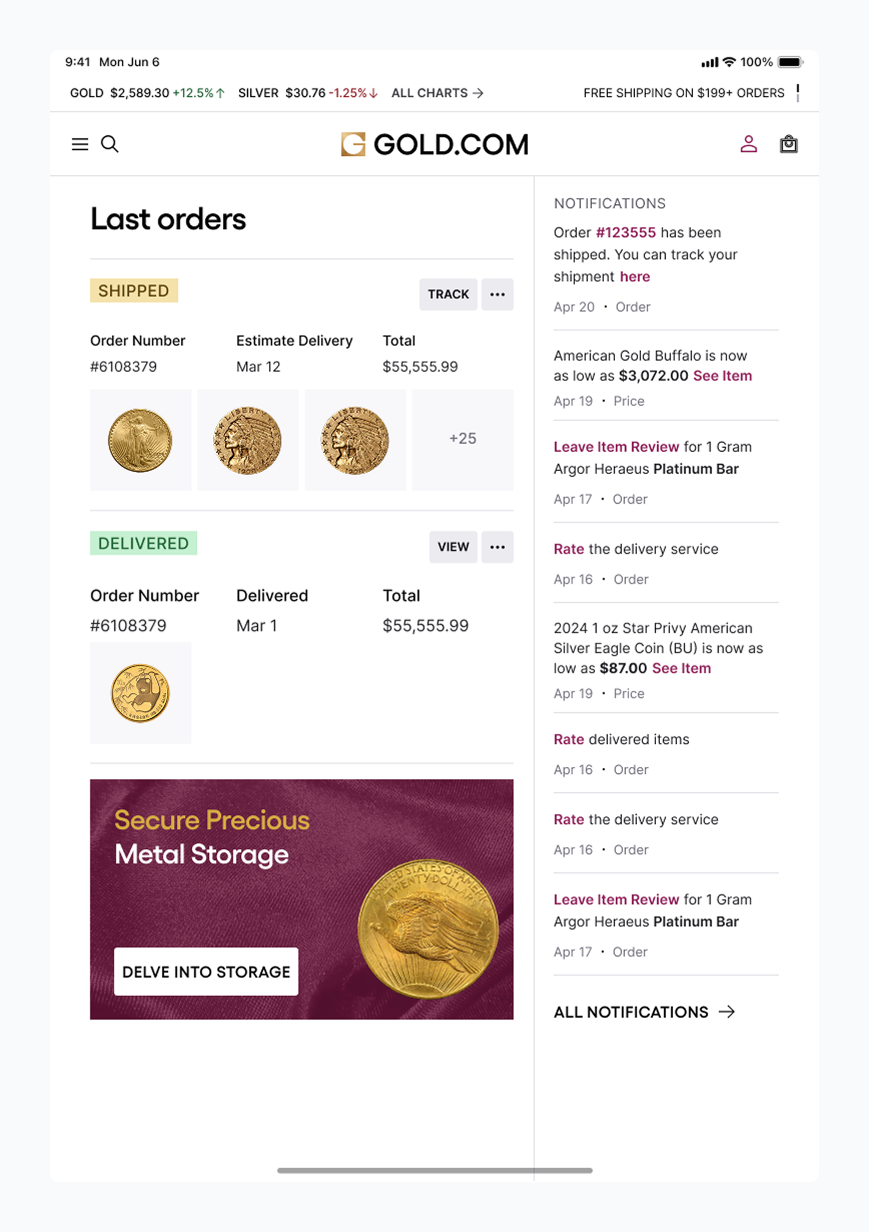
Key UX strategies included responsive layouts, simplified navigation, and streamlined flows for product discovery, purchasing, and account management. Pages like PDPs, CLPs, and PLPs were redesigned to combine product detail with market insight, helping users take informed action.
A modular content system powers real-time updates, educational tools, and product launches, while flexible templates allow for international growth. The result: a scalable, high-trust platform built for today’s investors — and tomorrow’s markets.

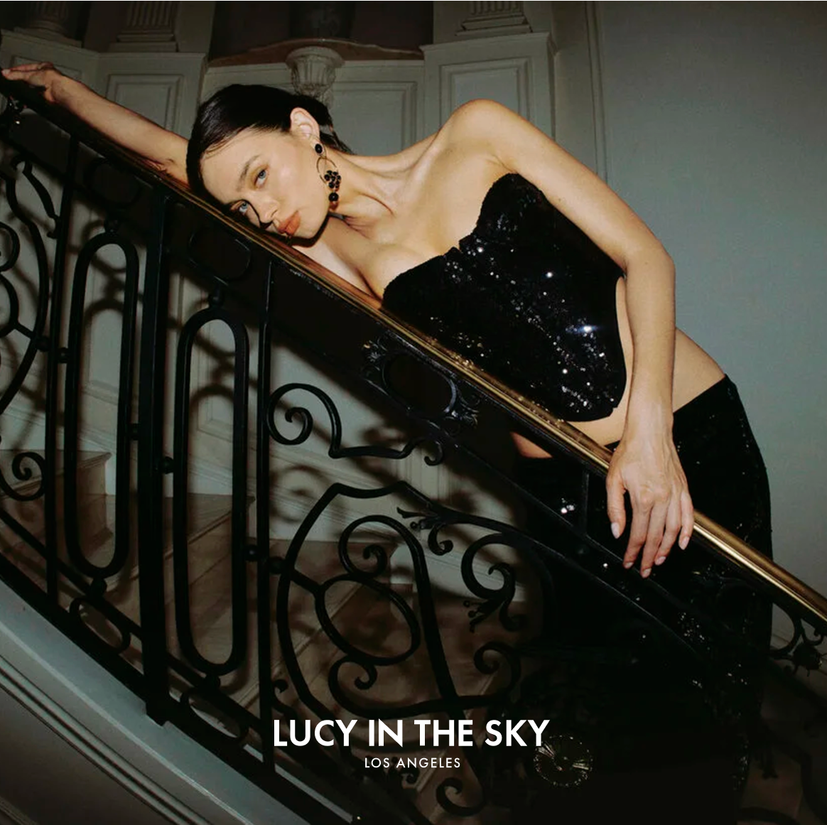
Balancing Light and Dark Themes
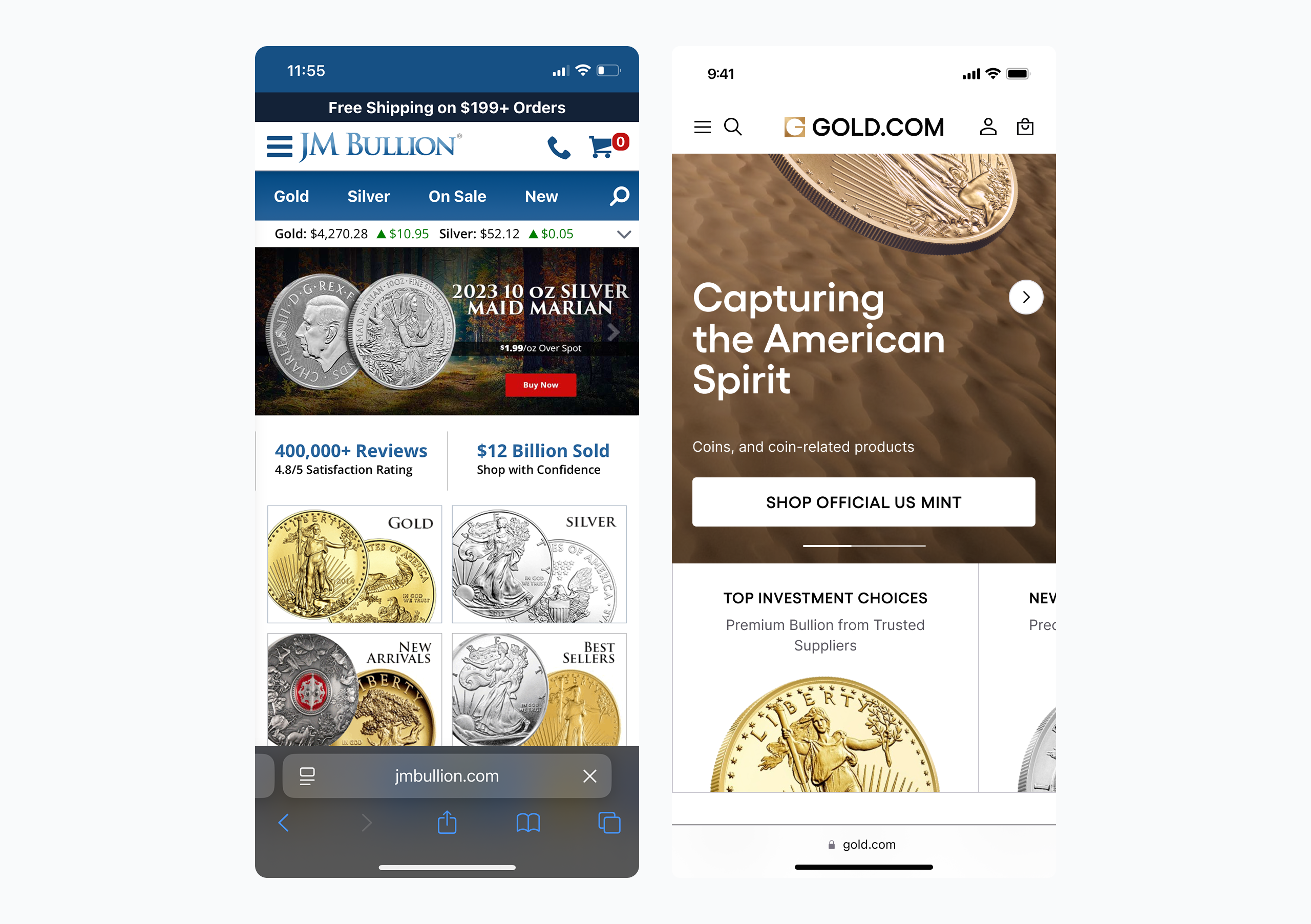
To convey a sense of reliability, a dark-focused visual style was essential. At the same time, users tend to perceive e-commerce experiences more favorably in a light UI. As a result, two distinct visual directions were developed to explore how the brand and marketplace could take shape.
The first direction was tech-driven and product data-focused. It used a combination of dark and light themes to convey precision, professionalism, and authority. Product visuals were prioritized, creating the feel of a high-end investment platform.
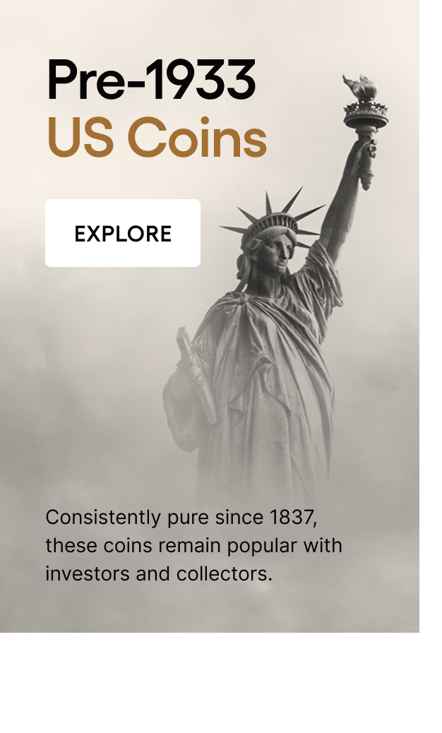
The second direction was inspired by Texas’s numismatic heritage. Based on a combination of dark and light themes, it referenced archival catalogues and editorial design, emphasizing storytelling, legacy, and the tactile value of precious metals adapted to the modern time expectations.
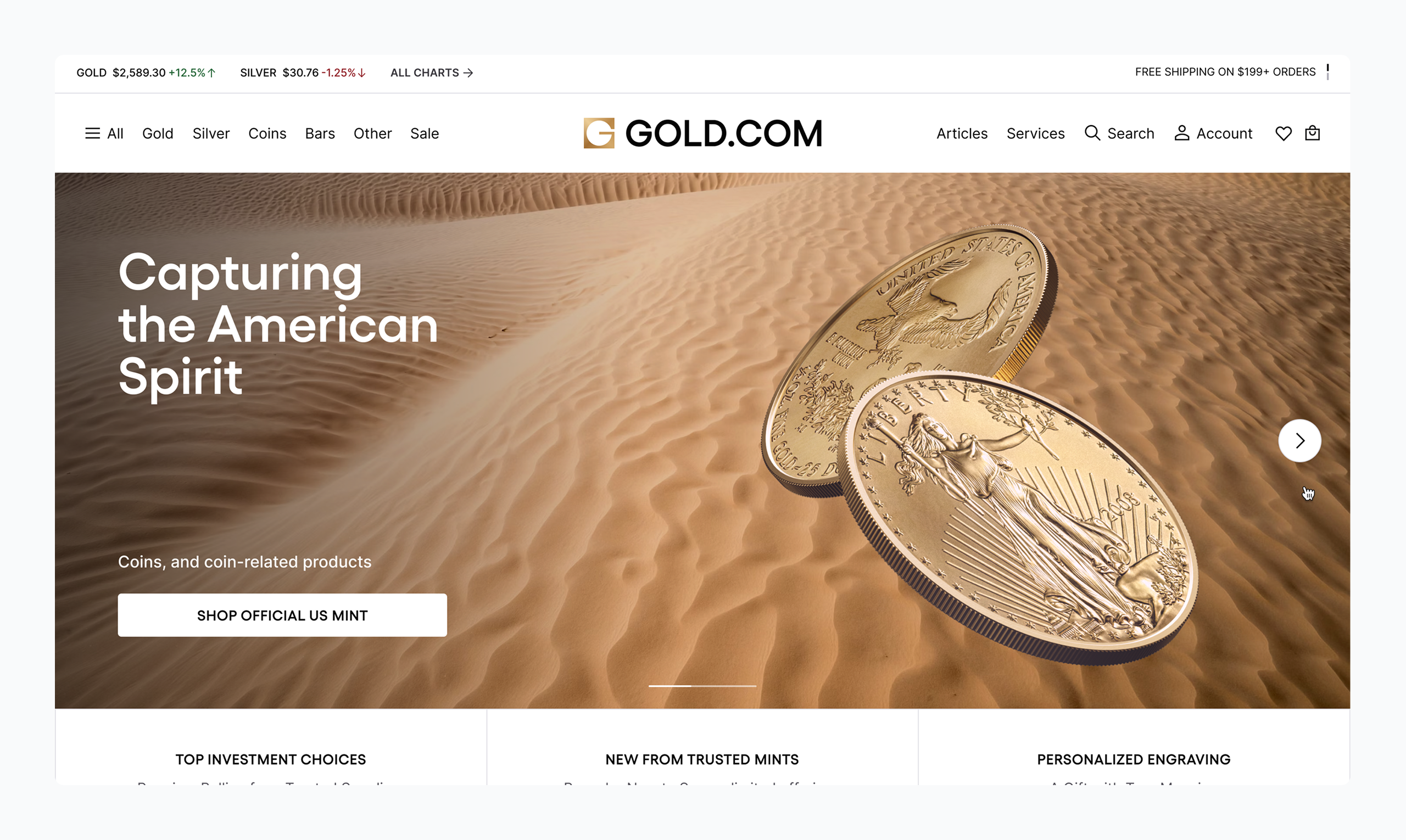
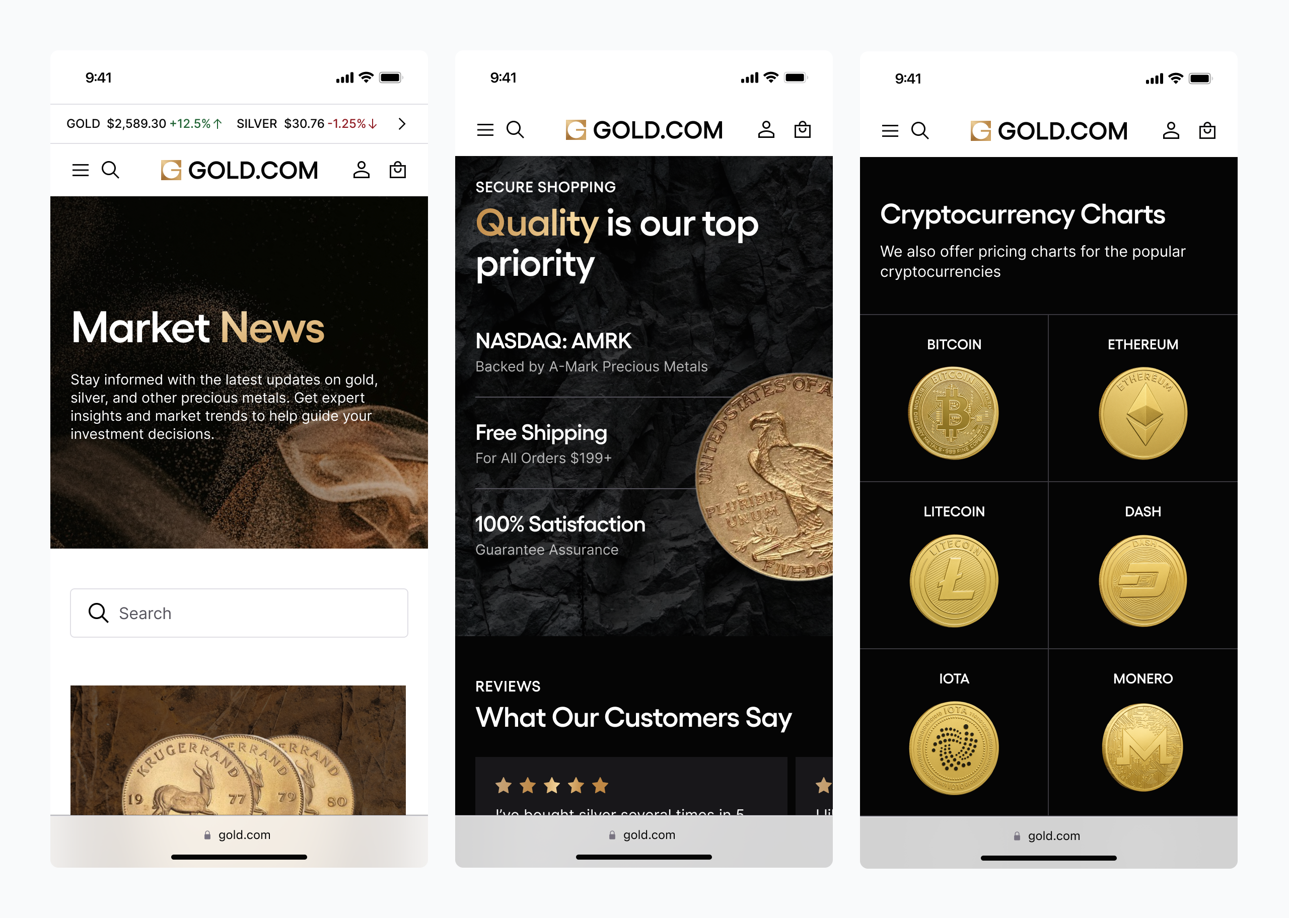
The final solution combined the strengths of both approaches, ultimately embracing dark mode with selective light sections.
Dark mode aligns strongly with the brand, maintaining consistency where black is a key color. It also creates high contrast, allowing gold elements to stand out sharply against the dark background and enhancing visual impact.
Additionally, since most competitors use light-themed websites, adopting dark mode helped Gold.com break the mold and present a bold, memorable presence.
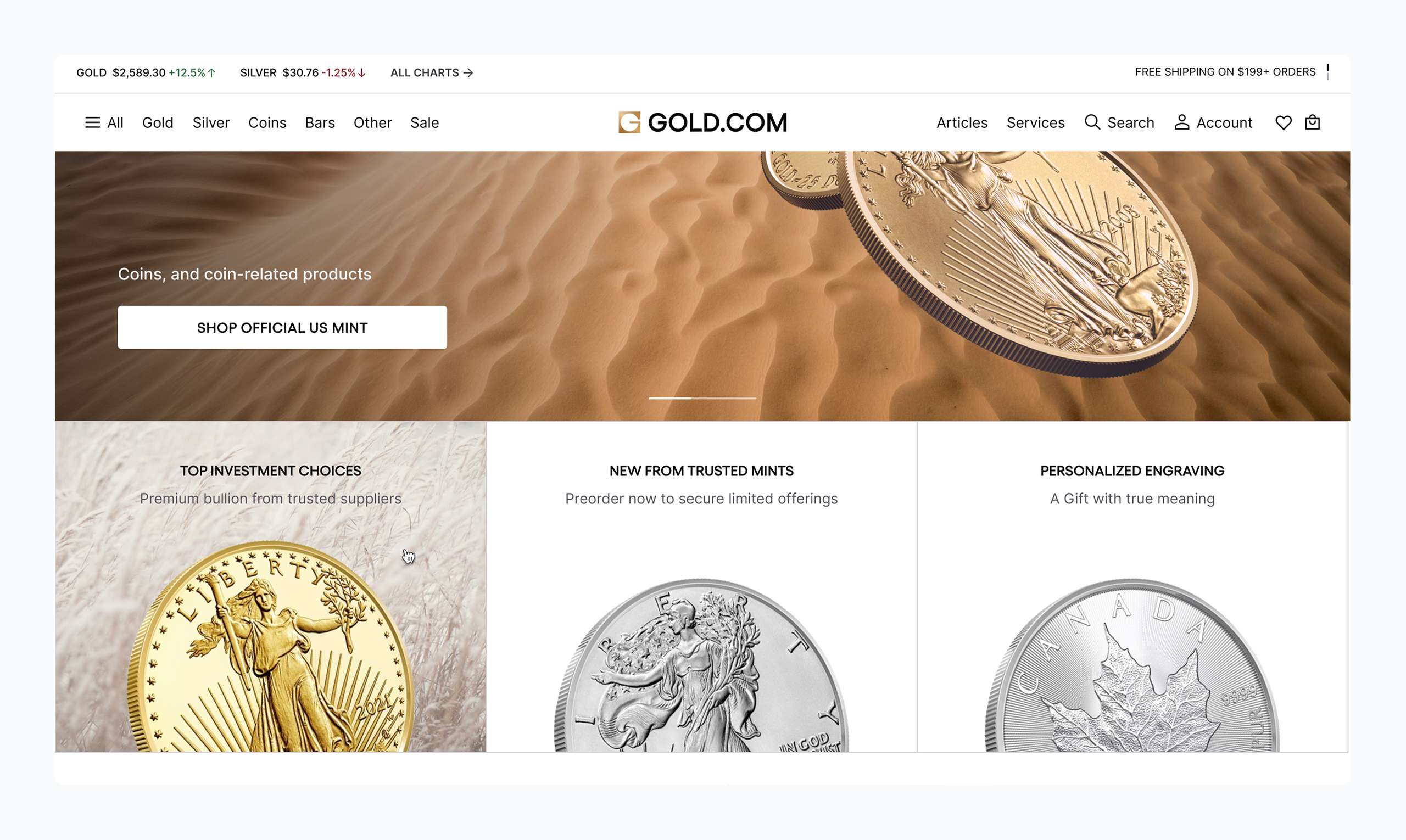
Light mode sections incorporated into the dark website add a conventional
e-commerce touch. Light-themed areas align with user expectations, reduce cognitive load, and create a familiar, seamless shopping experience. On a practical level, light mode improves compatibility and content performance, as most mints use product images on light backgrounds.
This balanced approach delivers a unique and impactful experience while supporting both usability and brand identity.
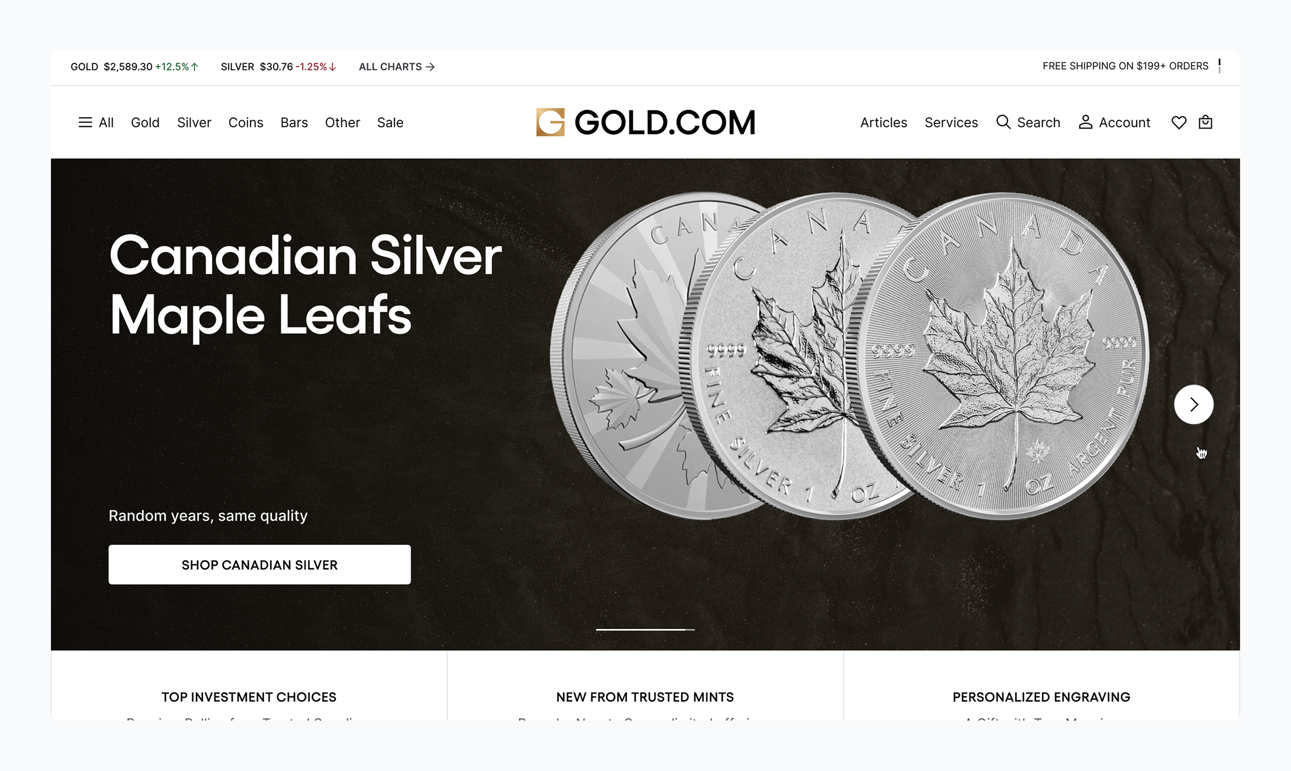
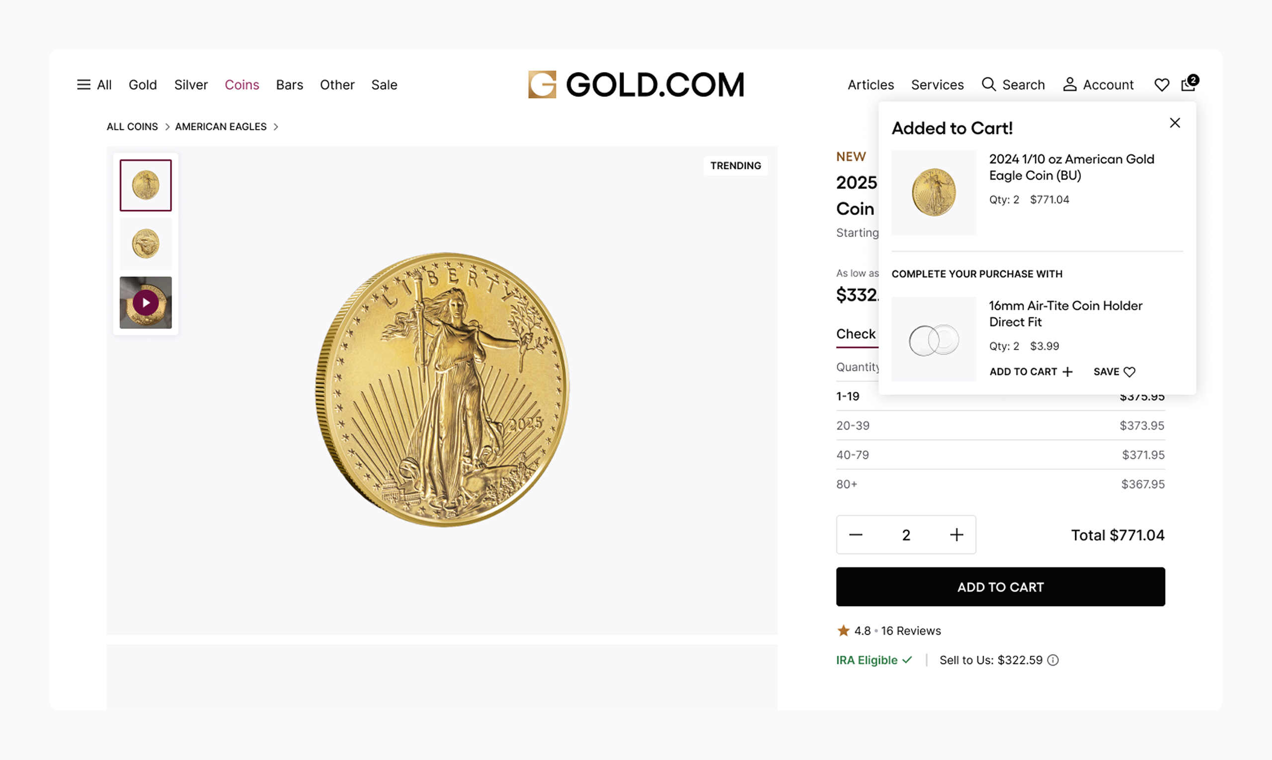
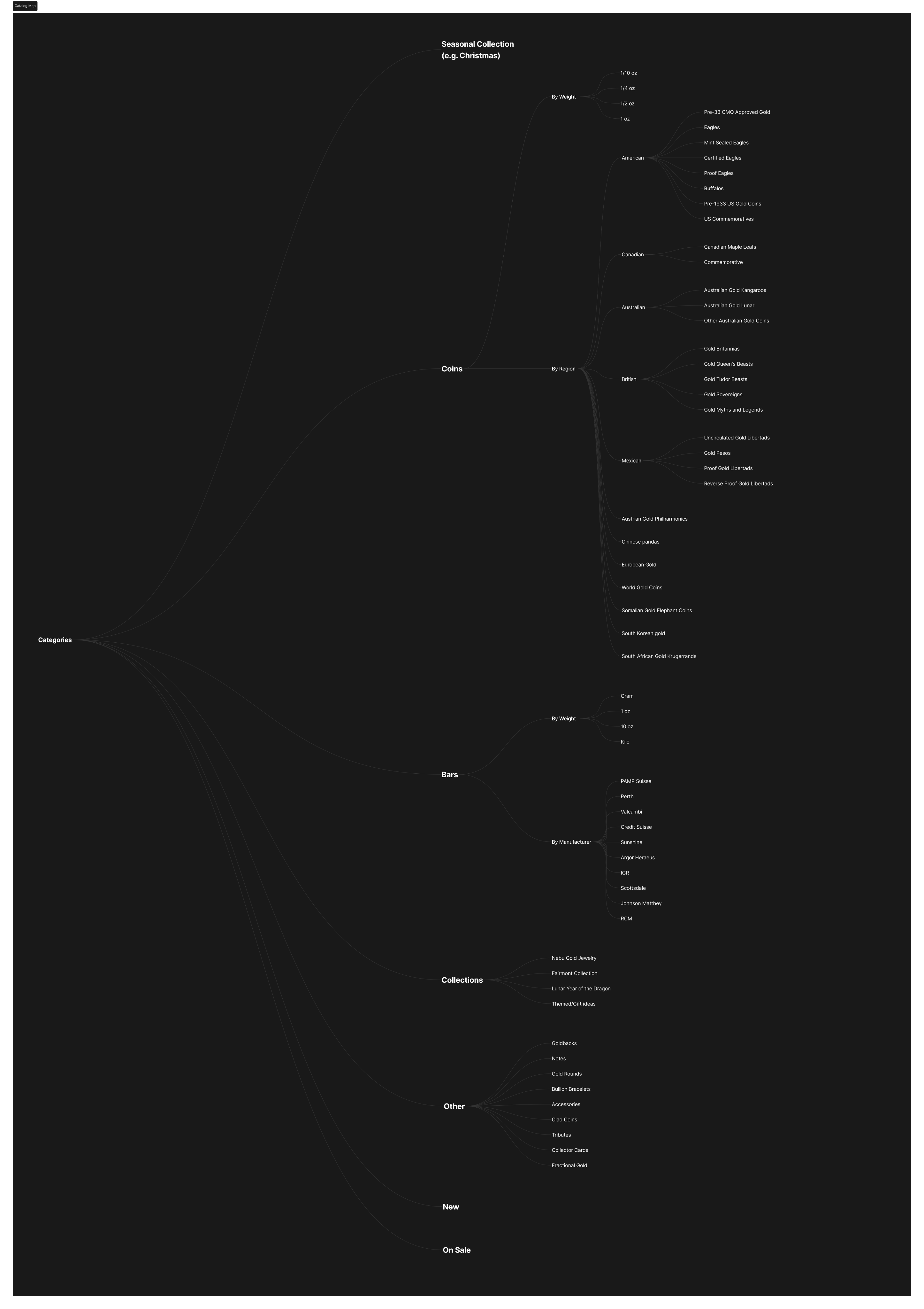
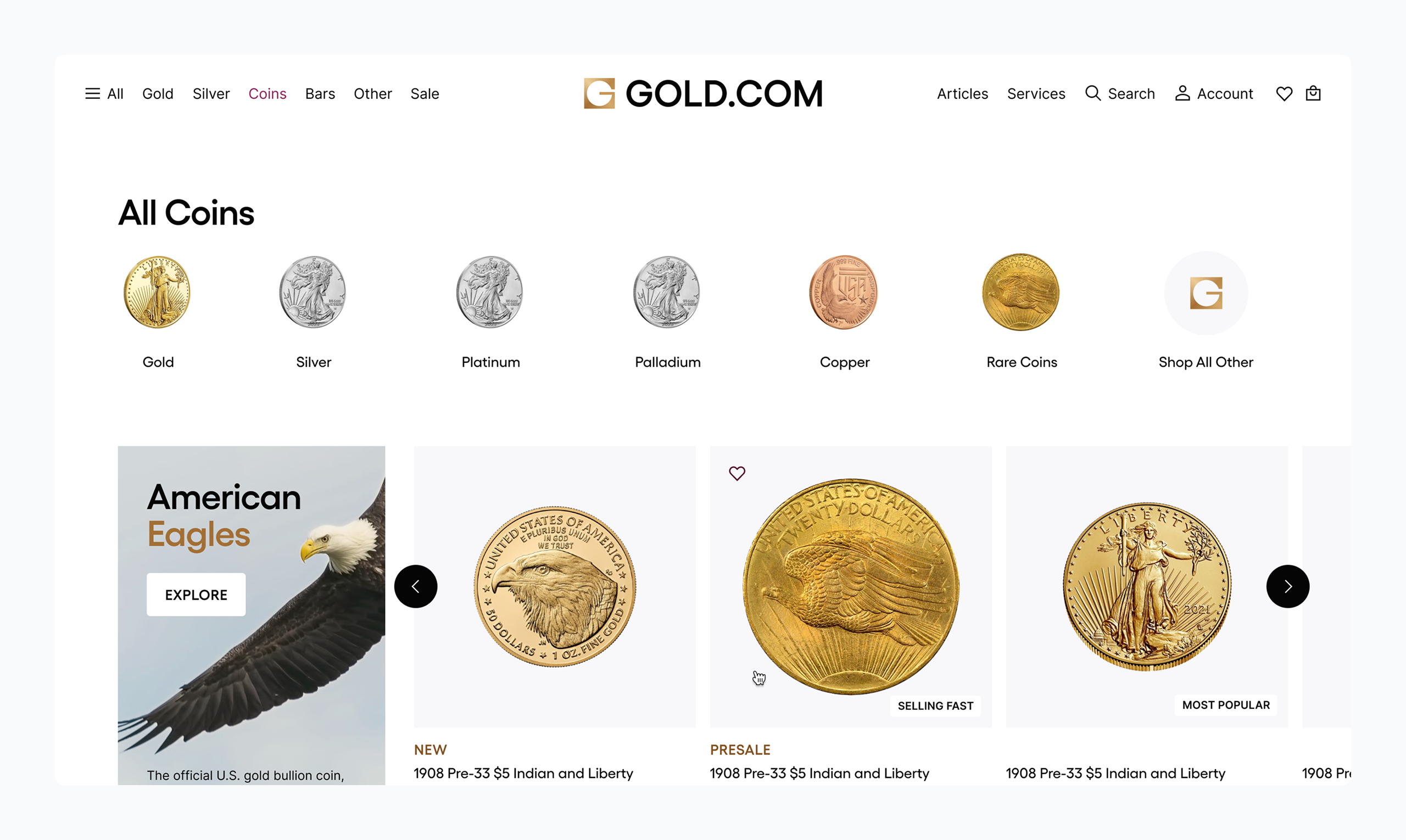
Putting Products at the Center of the Experience
The foundation of the Gold.com marketplace was built around a product-first strategy. Every design decision — from layout structure to photography guidelines — prioritized how items are displayed, explored, and evaluated by users.
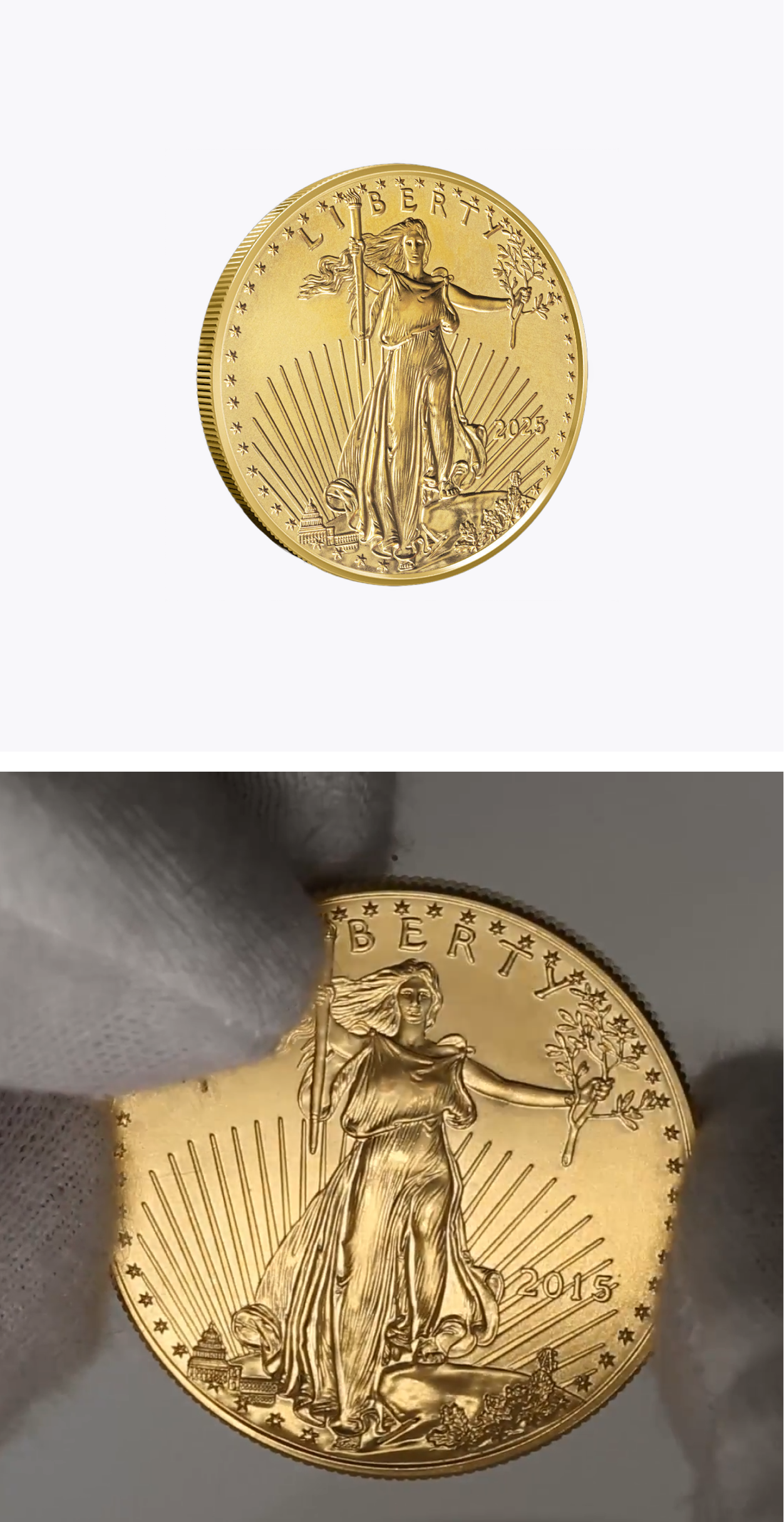
High-quality imagery was treated as core content — not decoration. The platform supports clear visual storytelling, with scalable templates that adapt to a wide range of formats, from coins and bars to historical collections.
Providing a Scalable Design System that Enables Global Expantion
To support the launch of Gold.com, a modular, AA-compliant design system was delivered to ensure consistency at scale. Built in Storybook, the system provides global teams with accessible, pre-tested components—reducing design debt and accelerating development. With version control and clear documentation, it enables seamless maintenance and expansion as new services and markets emerge, driving efficiency and coherence across millions of user interactions.
Providing a Scalable Design System that Enables Global Expantion
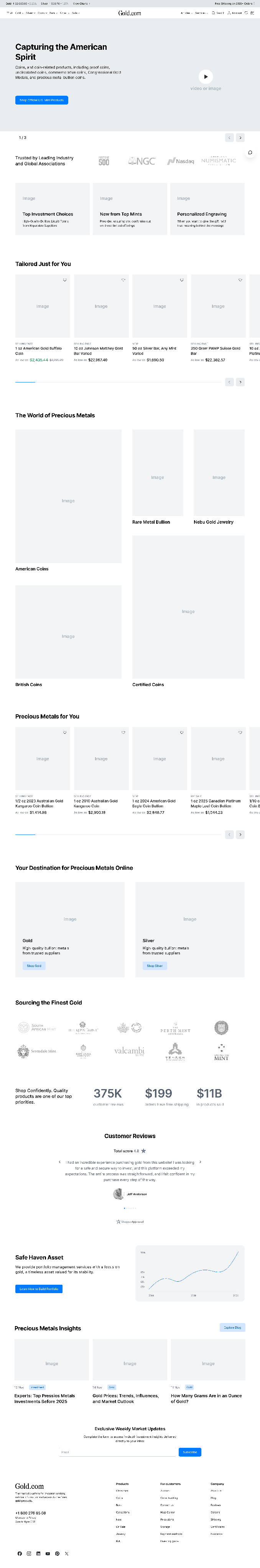
Once the structure and flows were validated, high-fidelity mockups translated the prototype into a polished user interface. Visual design focused on clarity, brand alignment, and accessibility — ensuring a refined look and feel while supporting user trust and decision-making. Each page type was built to scale, using a flexible component system that could adapt across breakpoints and regional variations.
Before vs After
Experience
Research and analysis
Experience vision and strategy
Concepting and prototyping
Motion
Operations
Iterative approach
Handoff
Prioritization and roadmapping
Design system
Brand
Industry research
Moodboards
Brand Identity application
Brand Identity assets