

Lucyinthesky.com
2023-2024
Simplifying The Path to Purchase
While Lucy in the Sky offered standout products, its digital experience fell short — especially for first-time buyers. Cluttered interfaces, unclear navigation, and high bounce rates signaled friction that hindered engagement and conversion.
The objective was clear: Create a seamless, intuitive experience that builds trust, invites exploration, and supports confident decision-making.
Results
Introduced new UX solutions for the B2C web store and mobile app, driving a 20% increase in web add-to-cart conversions and a 25% rise in mobile user engagement. Improved key metrics including bounce rate and average session duration by aligning user needs with brand and business goals.
Built a cross-platform design system for Flutter mobile and web, boosting design consistency and accelerating delivery speed by 30% across teams.
Project Milestones
1.
UX Audit and Best Practices
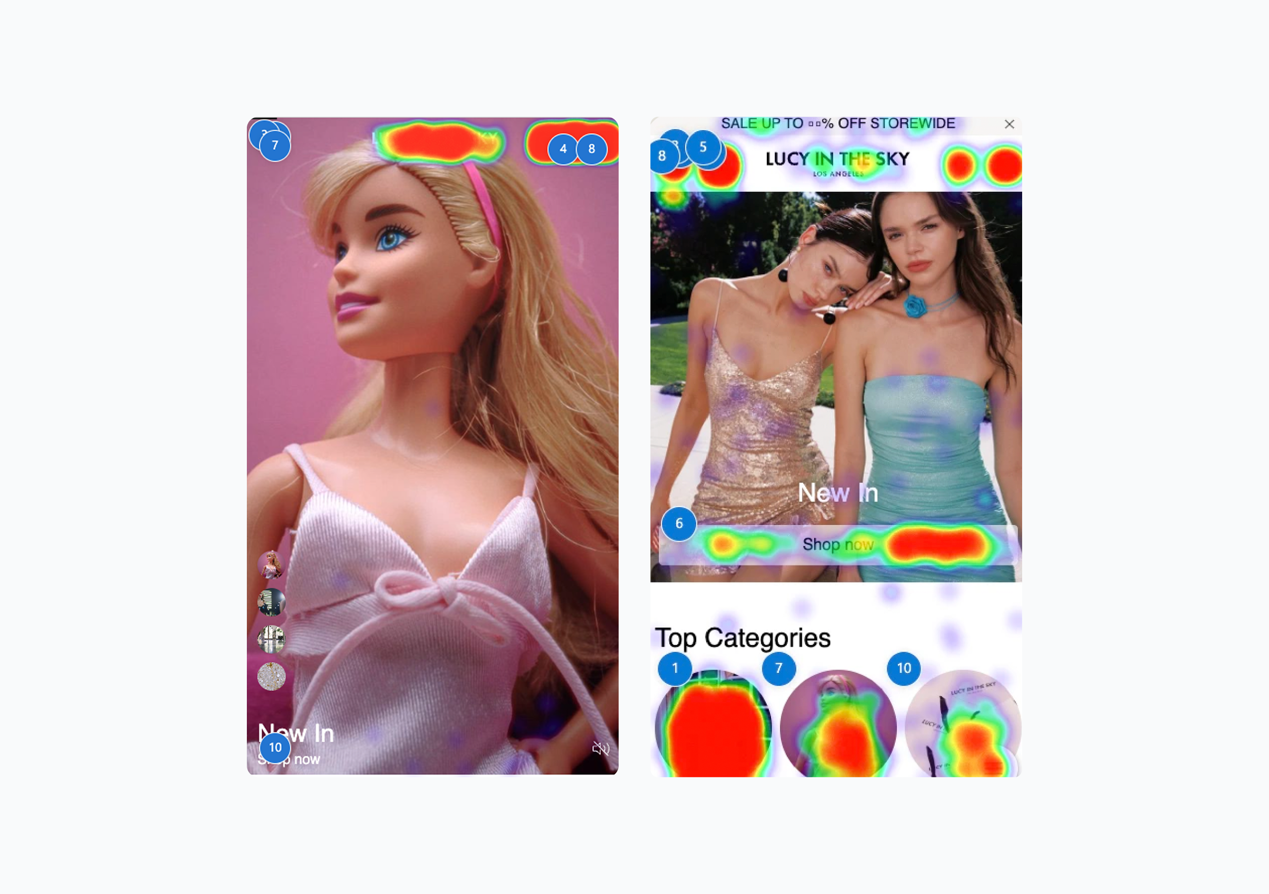
Evidence-Led UX: Translating Research Findings Into Actionable Designs
Clearly Communicate Site Purpose: Since 20% of users abandon websites due to unclear purpose, ensure the hero section immediately communicates the site’s value proposition. Showcase a diverse product range (covering at least 40% of the catalog) to set accurate expectations.
Avoid Disruptive Advertising Patterns: Ads on homepages—especially on mobile—are often perceived as intrusive. Instead, highlight promotions subtly and contextually to maintain clarity and trust.
Prioritize Clear Navigation: Use a visible horizontal navigation bar and a prominently placed search field. Direct links to key categories should be accessible without relying on hidden menus, particularly on desktop.
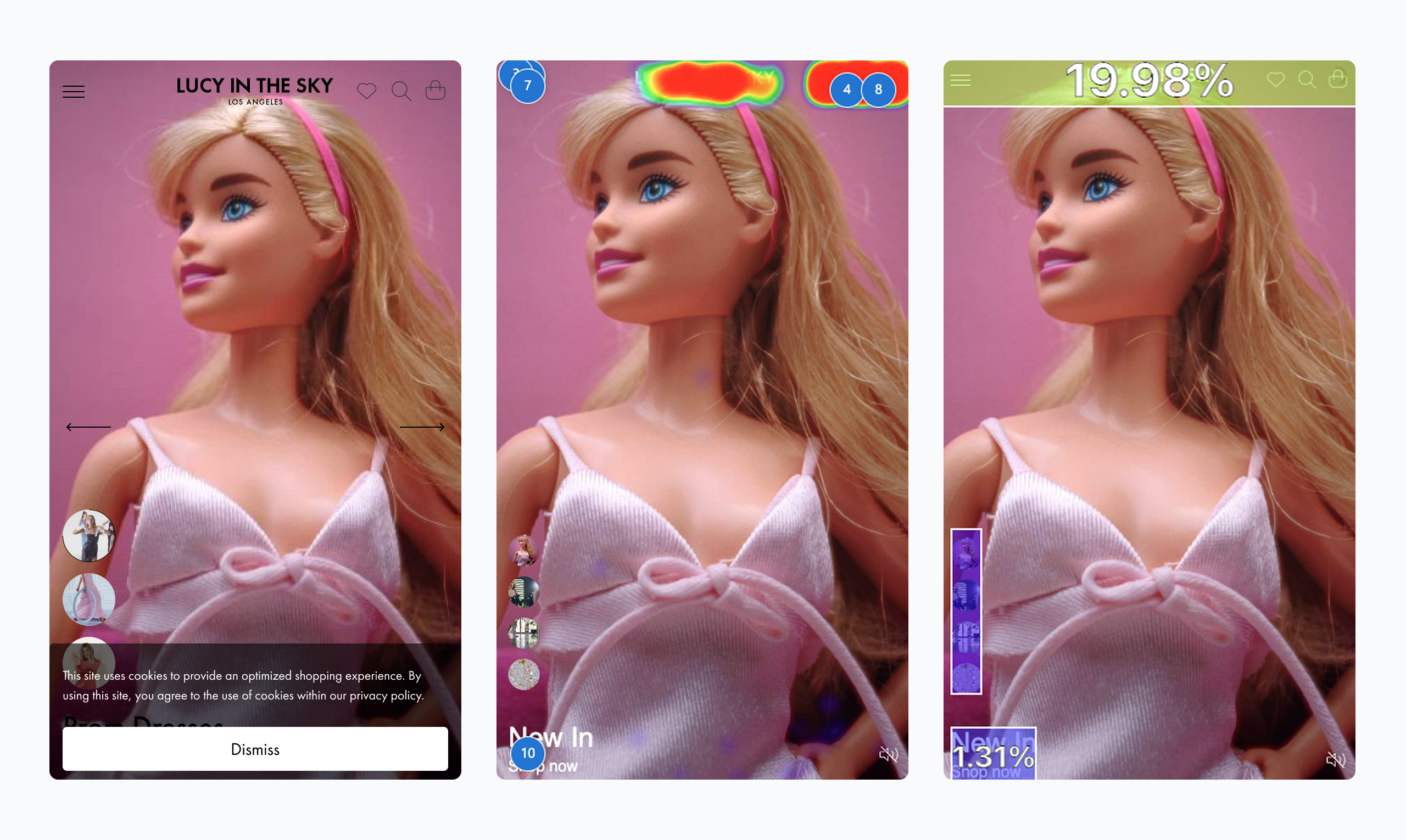
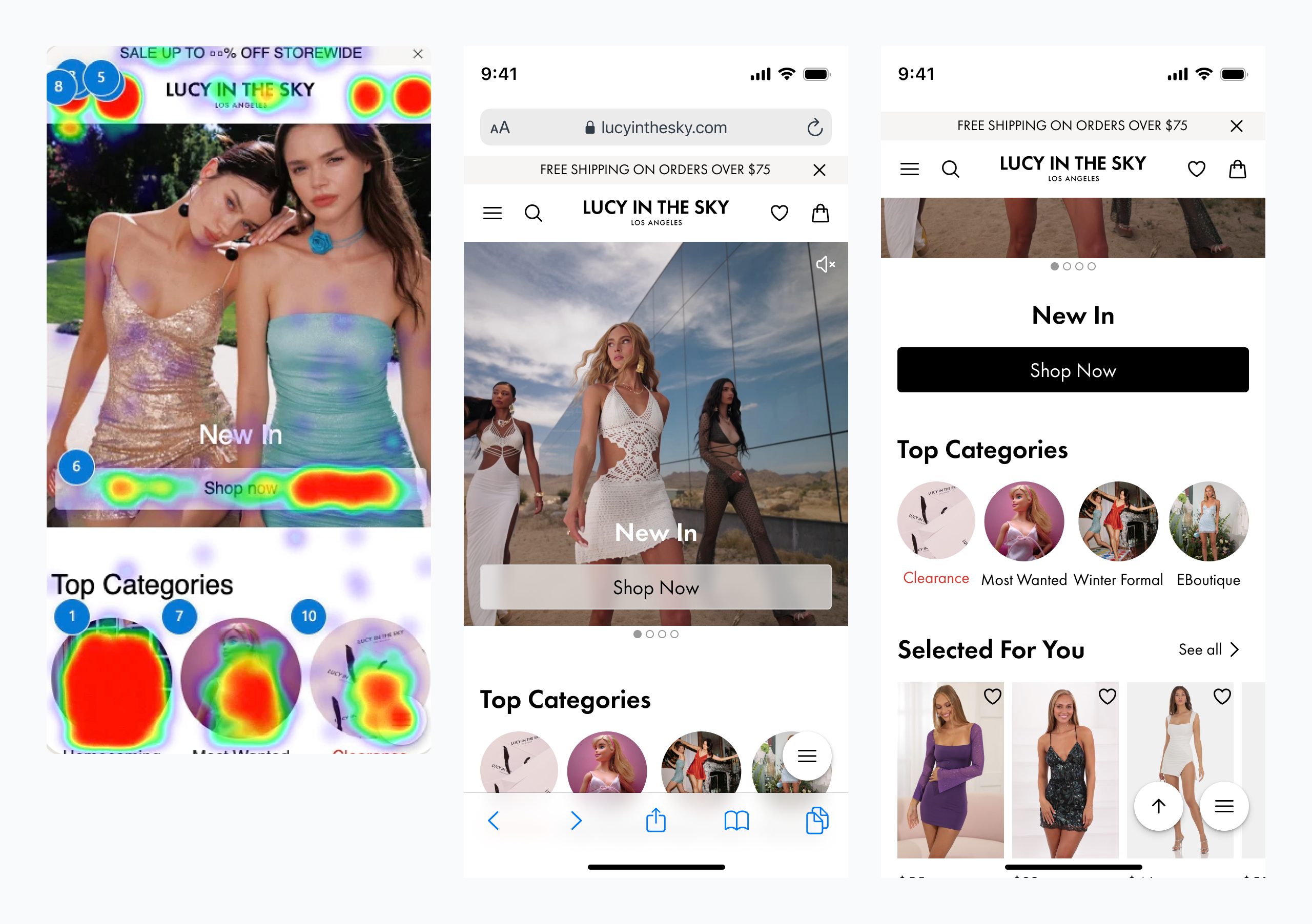
Eliminate Auto-Rotating Carousels: Avoid carousels with automatic transitions, especially on mobile, as they can hinder discoverability and overwhelm users. Focus instead on clearly presented, user-controlled content blocks.
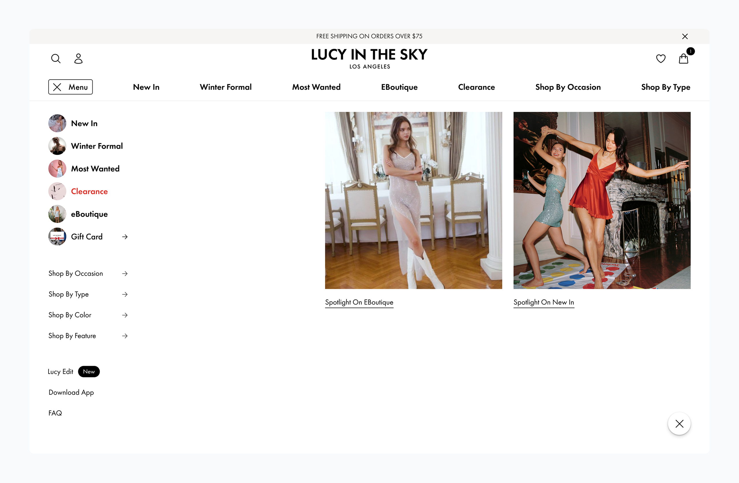
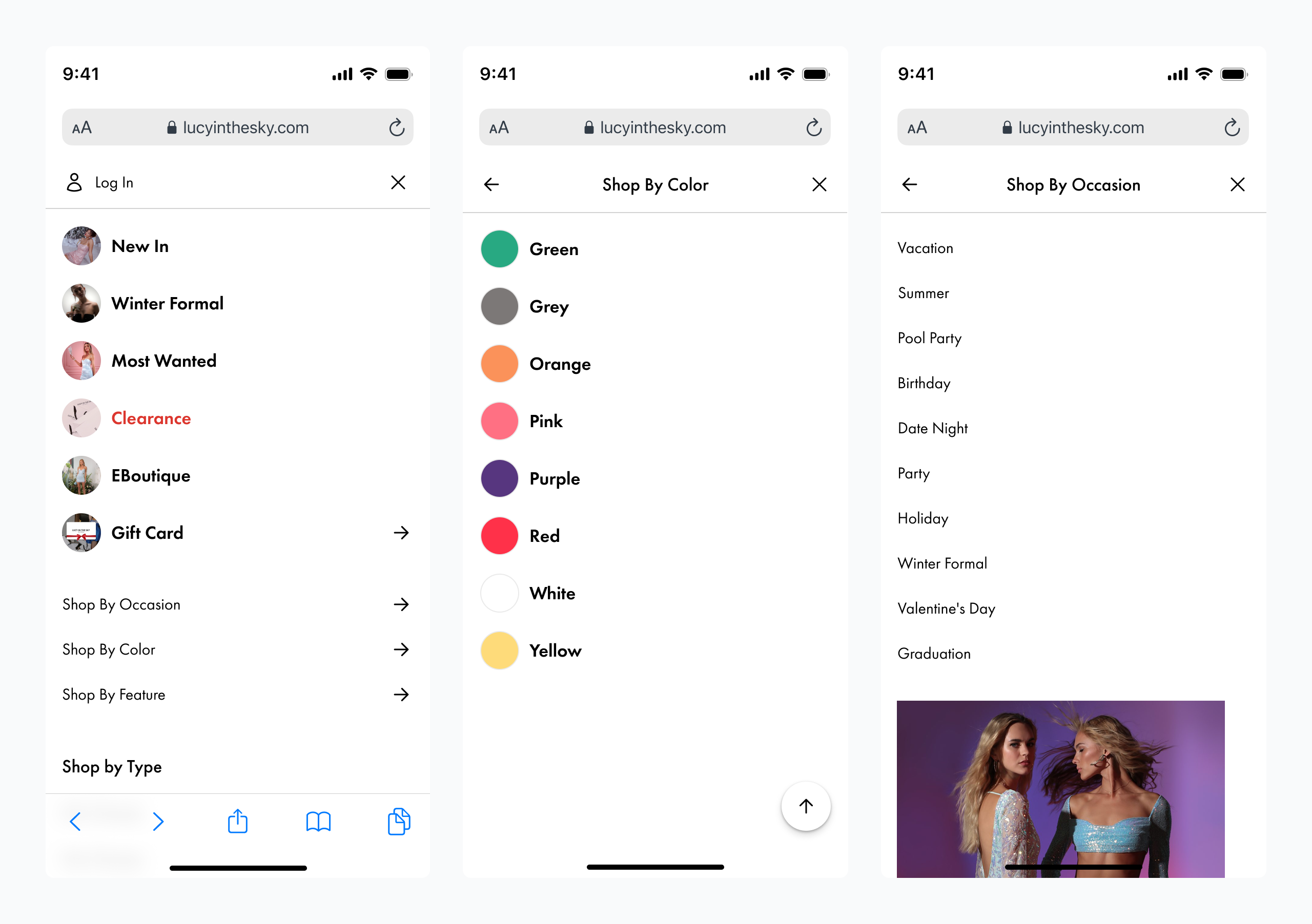
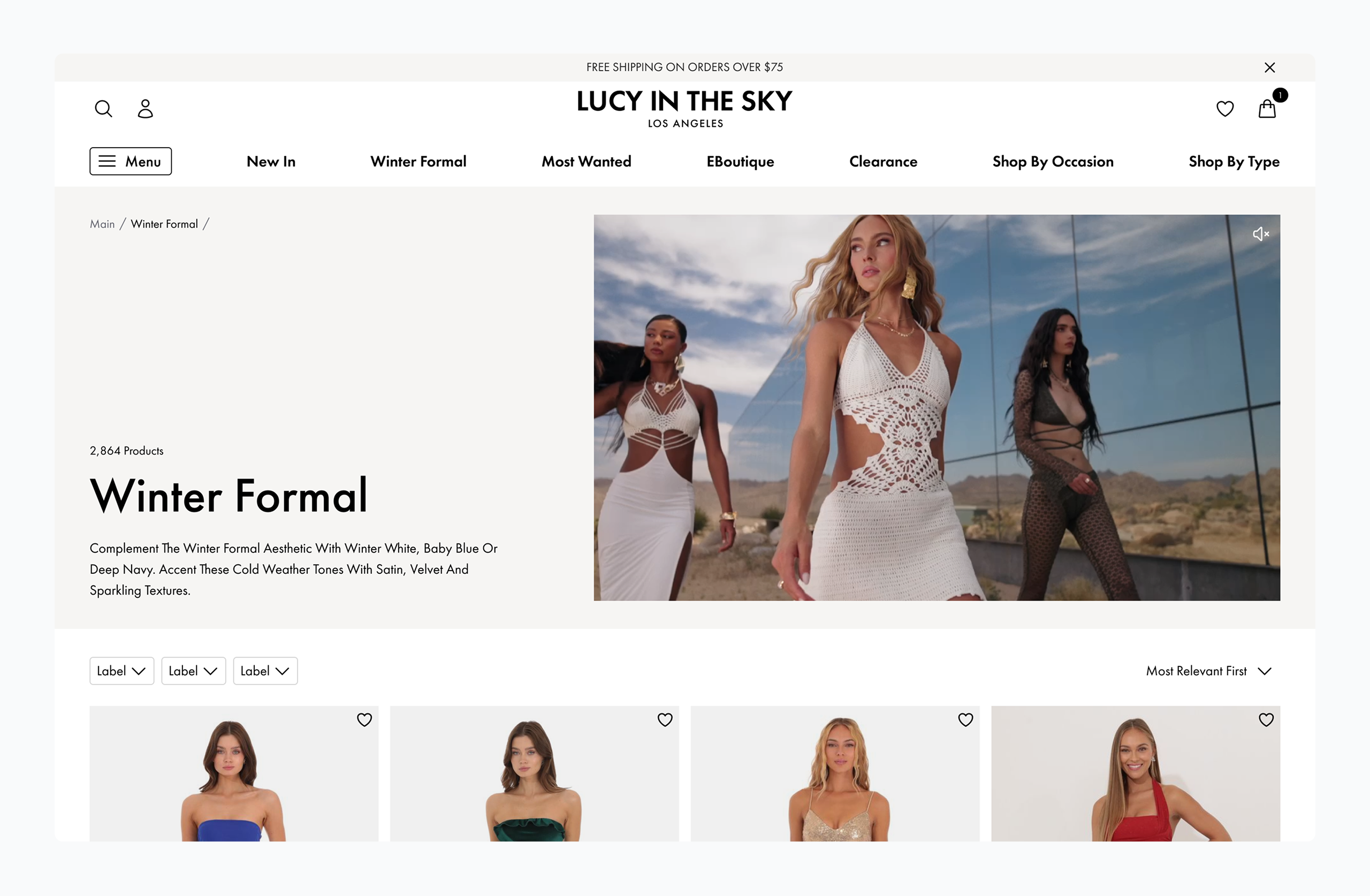
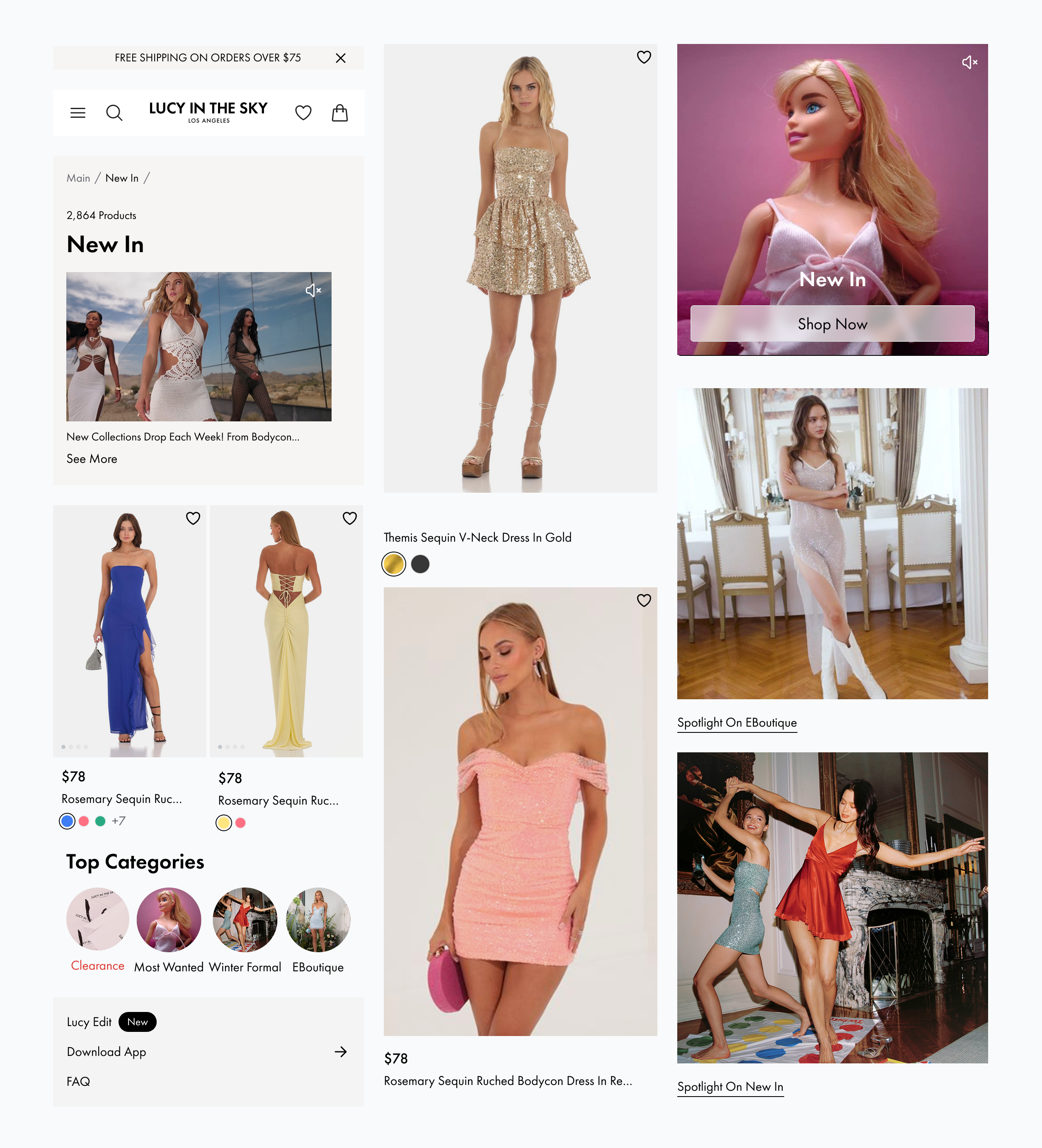
Making Occasion Shopping Clear
and Instant
A strategy grounded in audience behavior — tailored to ensure the platform supports time-sensitive, emotion-driven shopping with clarity and relevance.
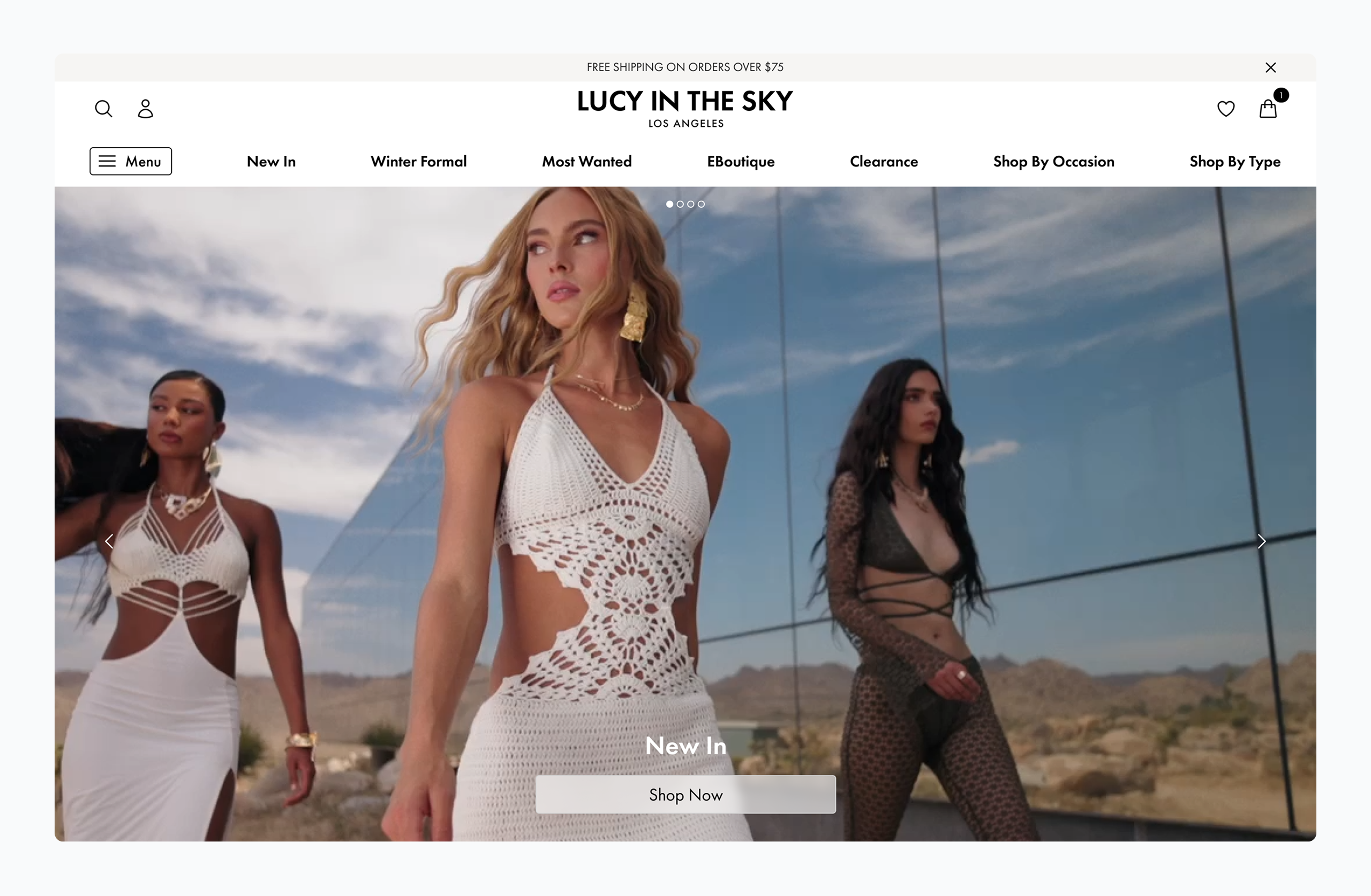
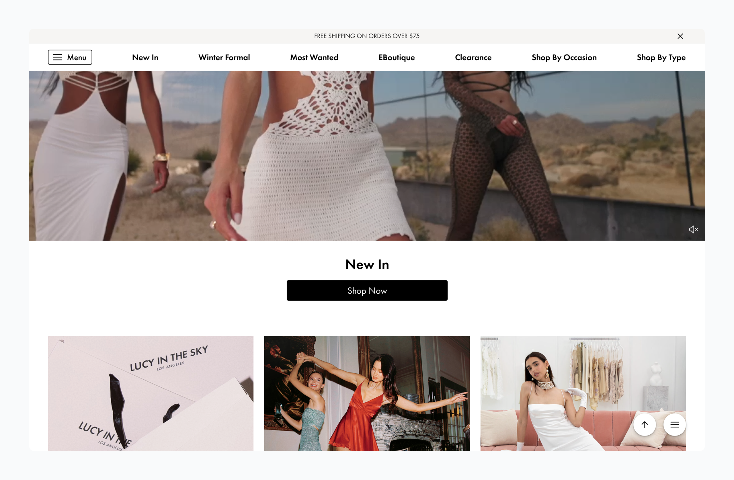
The hero section features a prominent, eye-catching visual with a clear primary call-to-action (CTA).
The homepage effectively captures user interest in special occasion shopping by prominently featuring the key category.
The experience is thoughtfully optimized for each device to deliver seamless, user-friendly interactions across platforms.
On desktop, the key category is prominently highlighted through the primary navigation using native, sticky interface elements that remain accessible as users scroll — supporting effortless exploration.
On mobile, the key category is featured as a bold, visually distinct element at the top of the homepage and reinforced with top-level placement in the main menu. To further enhance accessibility, the traditional hamburger menu is complemented by a floating action button (FAB), offering users a more intuitive and immediate way to explore and understand the full range of available items.
This responsive approach guarantees high visibility, contextual relevance, and smooth discoverability across all screen sizes.
When Making the Logo Bigger Actually Works
By clearly communicating that the store offers its own brand and consistent discounts, the redesigned hero section directly addresses Gen Z's deal-driven shopping behavior. Given that nearly half of this audience is open to choosing private-label products over more expensive brand names, the emphasis on affordability and value creates immediate relevance. This strategic shift positions the platform as a trustworthy, user-friendly destination for cost-conscious shoppers.
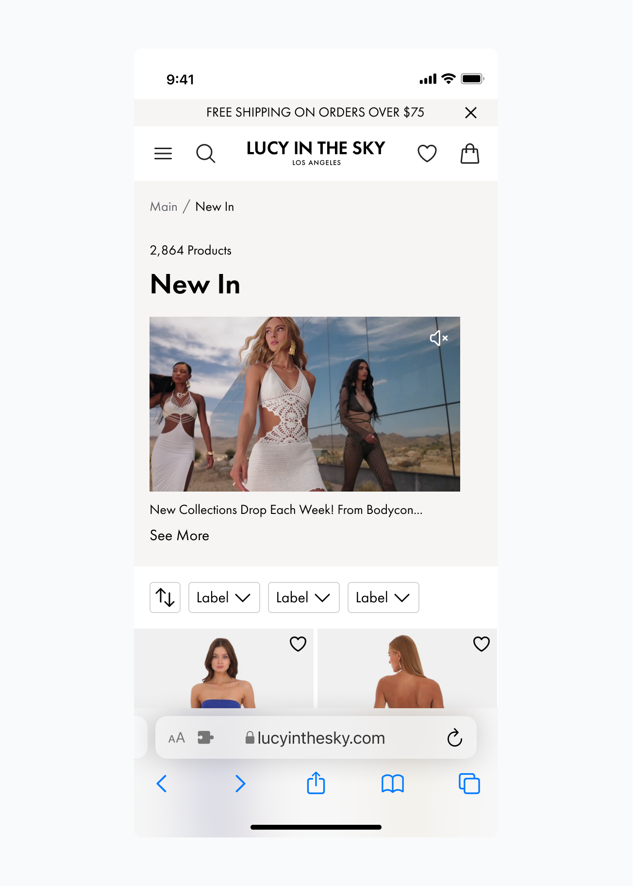
Eliminating Excessive Clicks
and Scrolling
The new navigation design features clear, easily recognizable thumbnails for each occasion, enabling users to quickly find what they need. It utilizes the full viewport, eliminating the need for scrolling.
A/B Testing Validated Impact: The new navigation significantly reduced bounce rates, increased session duration, and improved product discovery—prompting a full rollout based on measurable user engagement gains.

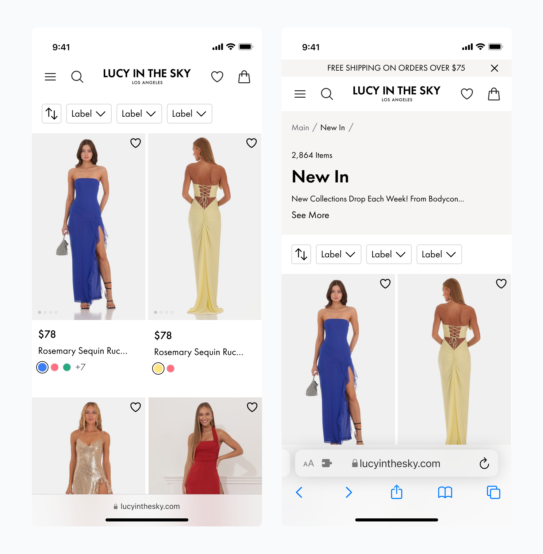
Shifting Focus to Drive Product Discovery and Purchase
The redesigned layout significantly reduced the banner area, shifting visual focus toward product imagery and key purchase paths. By removing friction —such as hidden navigation, overloaded interfaces, and poor hierarchy — the new structure makes products immediately visible and accessible.
This strategic change improves user orientation, shortens decision time, and increases engagement with the catalog.
Empowering Scalable Design Through Component Setup
Using a headless component setup, I built a flexible design system tailored to the brand — enabling reusable, consistent patterns and faster implementation. This approach improved cross-functional collaboration, streamlined development, and ensured long-term scalability.

Before vs After
Experience
Design strategy
Research and analysis
Concepting and prototyping
Operations
Iterative approach
Team workshops
Design system